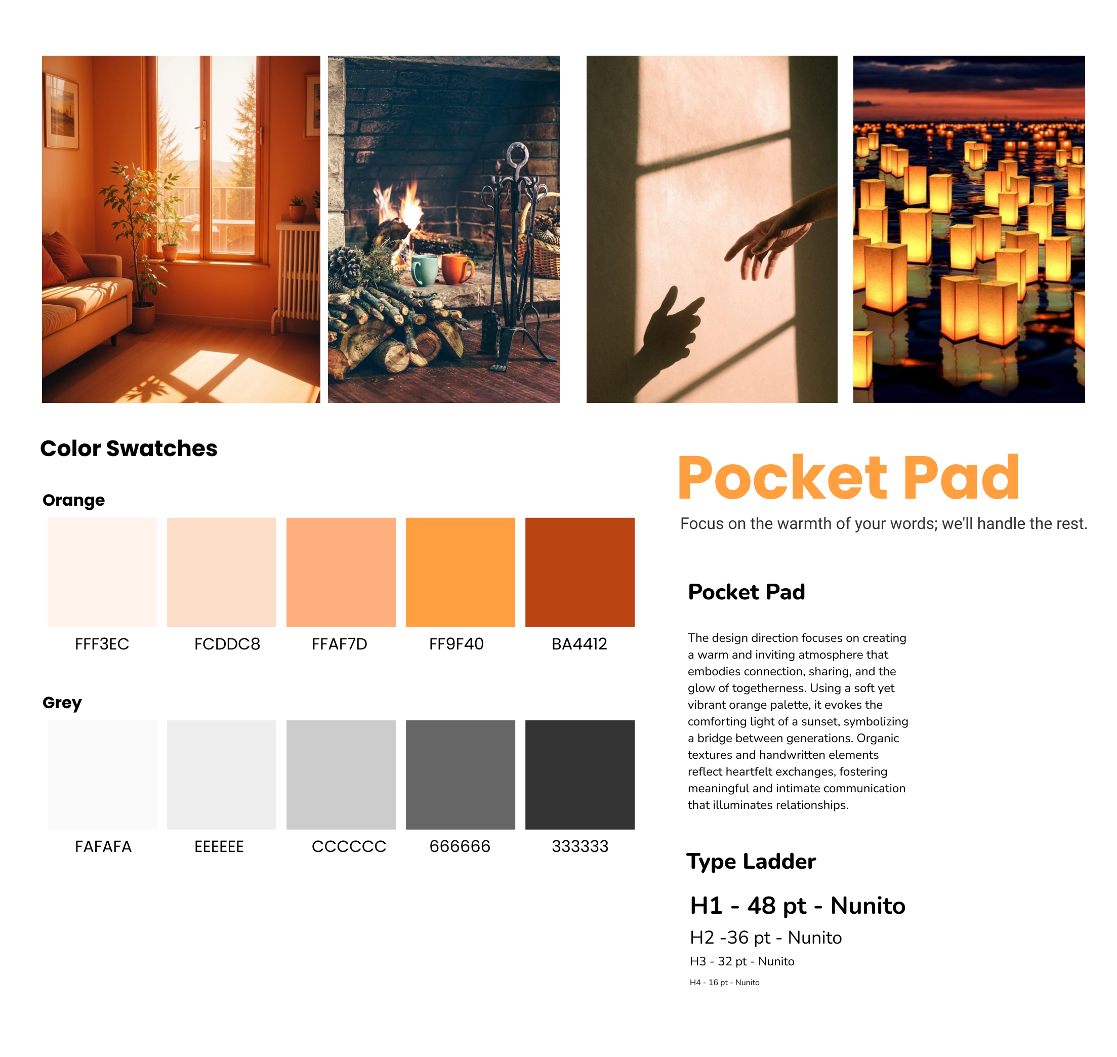
The Pocket Pad
4 months
Wholesome Global Food Co. Ltd.
UI/UX design
Research
Yit Chung
Yuri Kawada
Yechan Choi
Gily Yu
How We Built a Social-Connected Product for Parents and Children in Just 2 Months
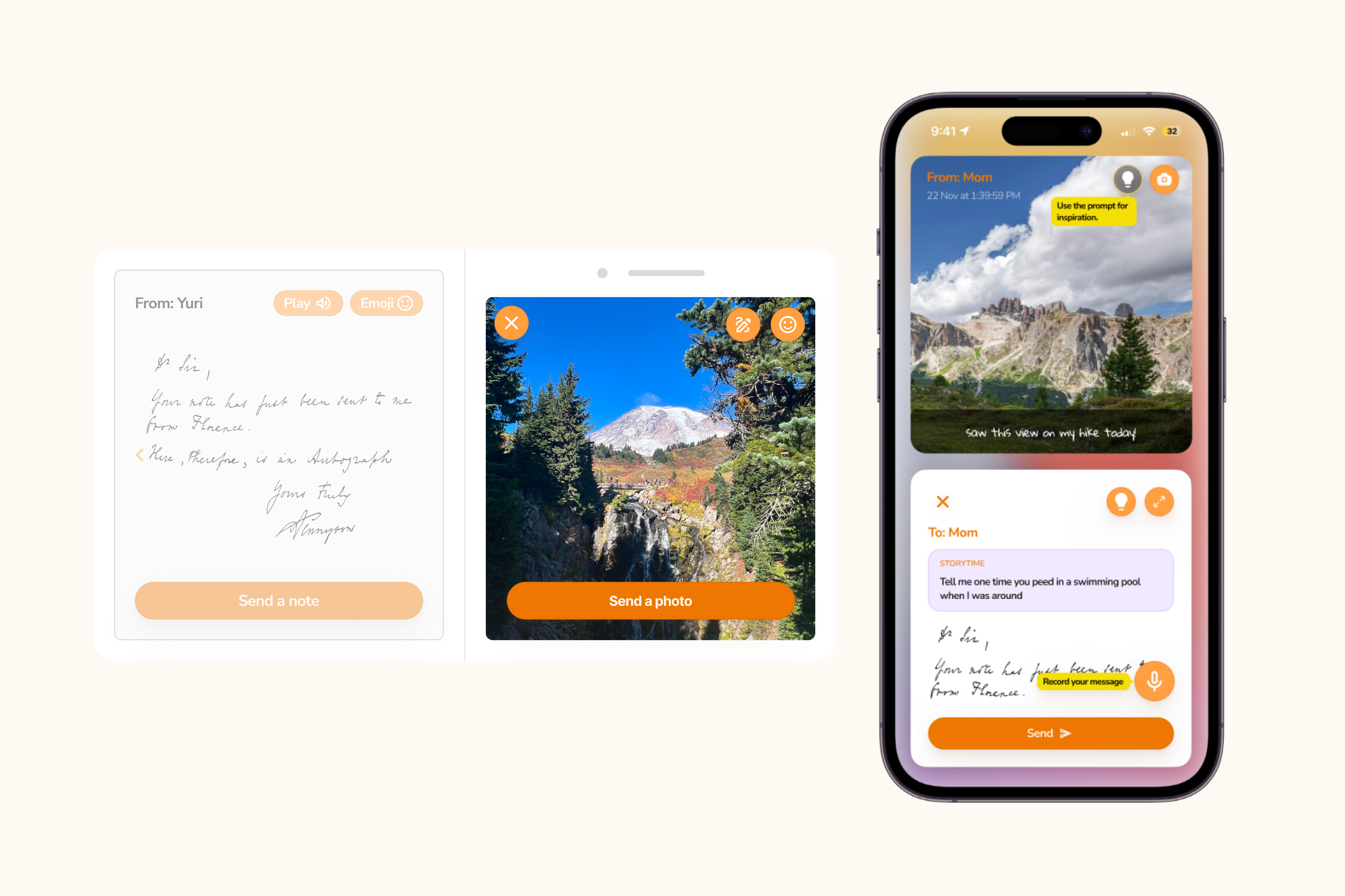
Pocket Note is a two-device solution designed to connect aging parents and working children when obligations can make creating or maintaining an emotional connection otherwise difficult.
Background
With an aging population and an increasing life expectancy worldwide, along with rising living and insurance costs, families spend less and less time with each other. Aging seniors also face increasing reports of loneliness, which greatly affects quality of life and family connections. Furthermore, working children and parents face a dilemma: working children cannot afford the time to keep in touch with their parents, and aging parents face tech-illiterate, particularly in the 75+ age demographic.

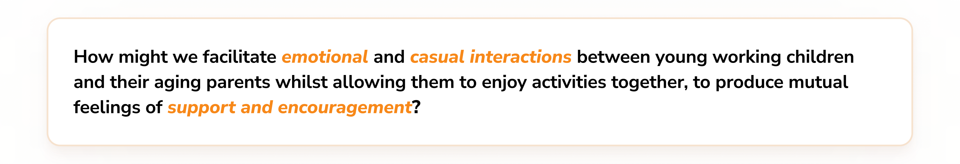
Problem Statement & Design Goals
Analysis
Research was conducted to understand the habits of working children and aging parents. The following section describes the approach we’ve decided to take to capture relevant findings.
Secondary research
Since the problem area was quite broad, we recognized the need for some reality checks. To narrow down our focus and ensure our direction had a potential market, we conducted secondary research. We found 5 relevant papers and numerous Reddit discussions to supported our approach, indicating strong potential for our product.
Survey
After synthesizing our secondary research findings, we wanted to understand concretely the relationship between working children and aging parents. With such a broad area, conducting a survey helped us fine-tune our scope. This also helped us to decide on which direction we’d like to take our research, and eventually our final design solution.

User interviews
We conducted user interviews on 5 working children and 4 parents, with a total number of 9 participants. These interviews were semi-structured, which allowed us to probe deeply into our participants and to truly understand their experiences and pain points.
Research findings
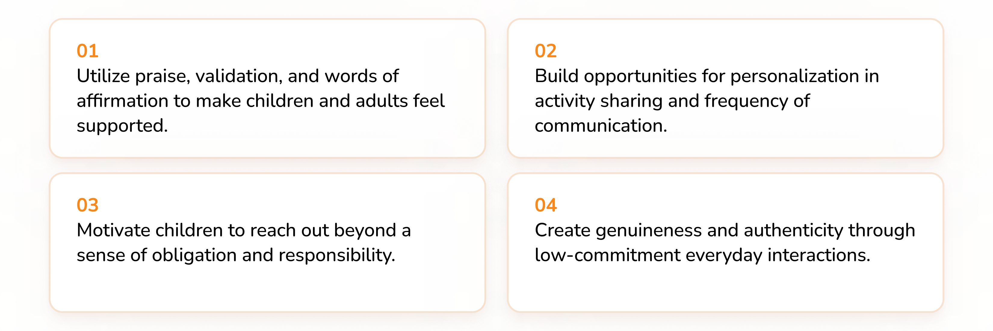
Most Impactful Research Findings
- There is a level of obligation and responsibility from the working child’s side. Children were often driven by a sense of obligation, as they view the relationship as responsibility for their parents’ raising them up.
- There are also mentions of friction between children and parents. Sometimes, there’s an emotional barrier between these groups, leading to surface level interactions and alack of emotional connection.
- A yearn for closeness exists for both working children and aging parents. Participant son both ends mentioned that closeness was important.
Personas
Our research findings led to two unique stakeholders to represent working children:
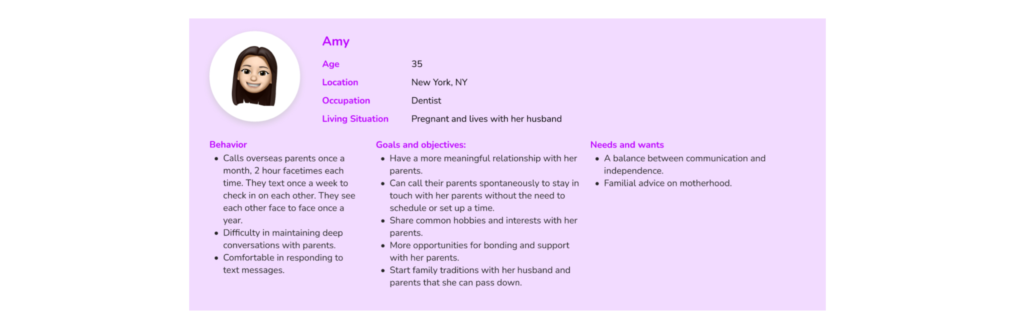
Primary Stakeholder 1: Amy
Our “Amy” persona. Amy is quite close with her parents, despite her busy schedule.
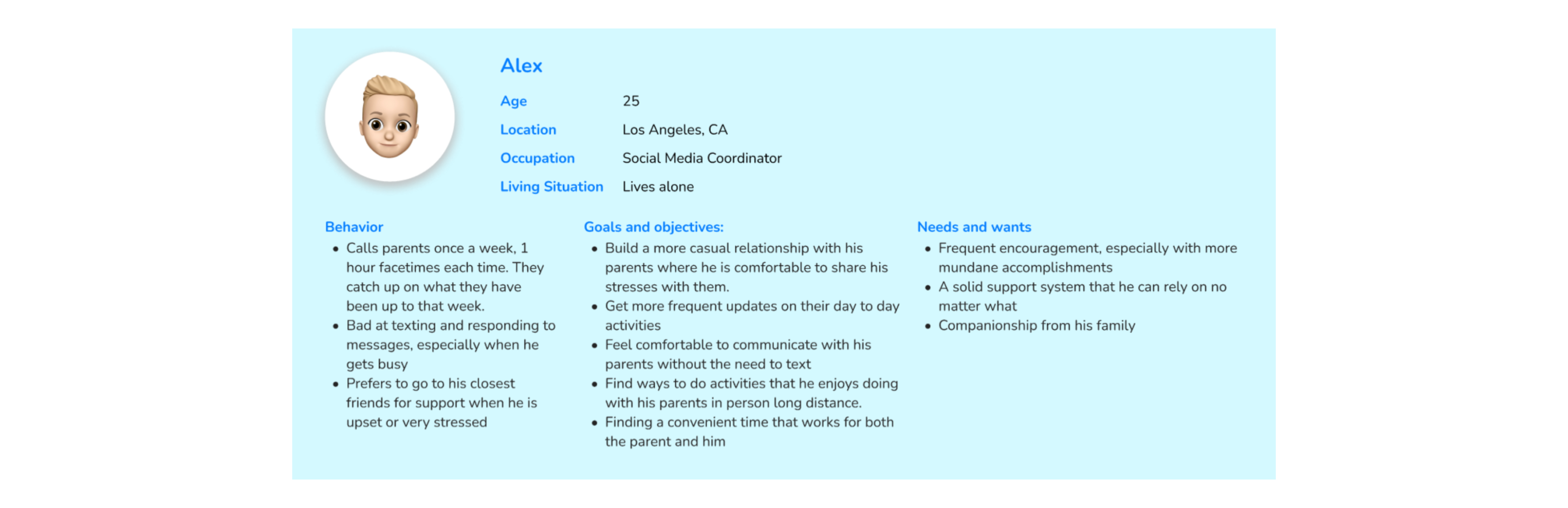
Primary Stakeholder 2: Alex
Our “Alex” persona. Alex likes his parents, but it’s far more casual than Amy’s.
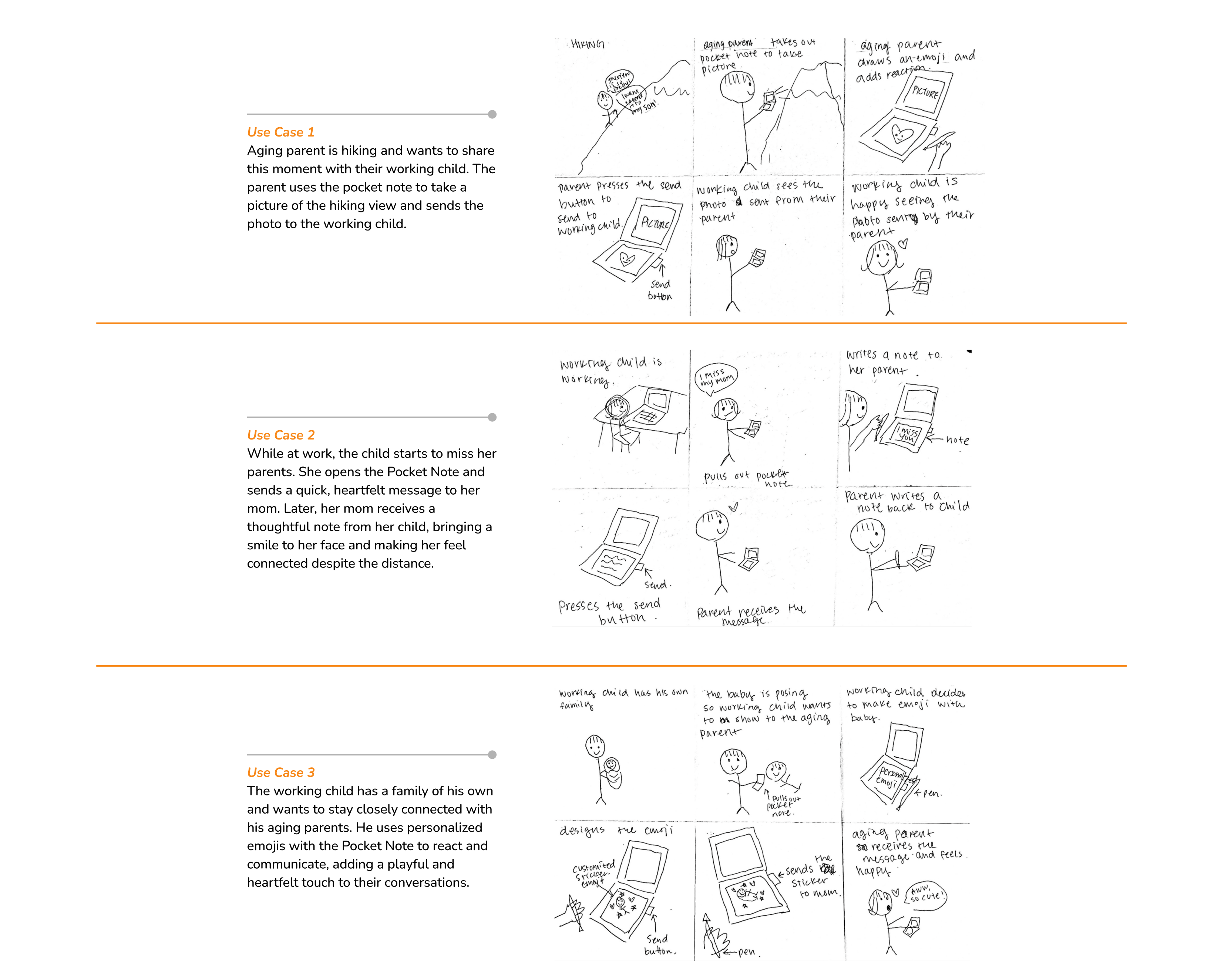
Use Cases and Storyboarding
We created 3 use cases for how aging parent and working children could use our Pocket Pad.
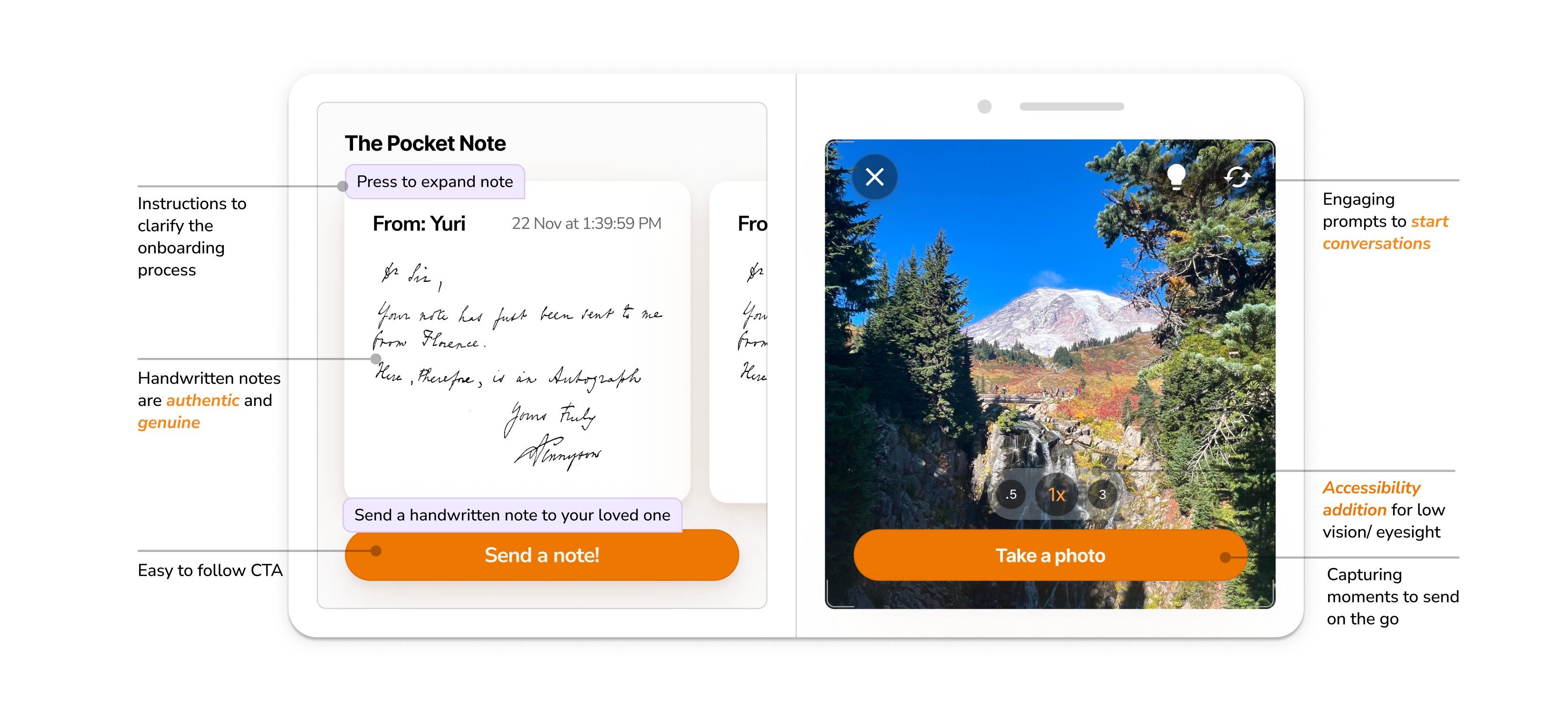
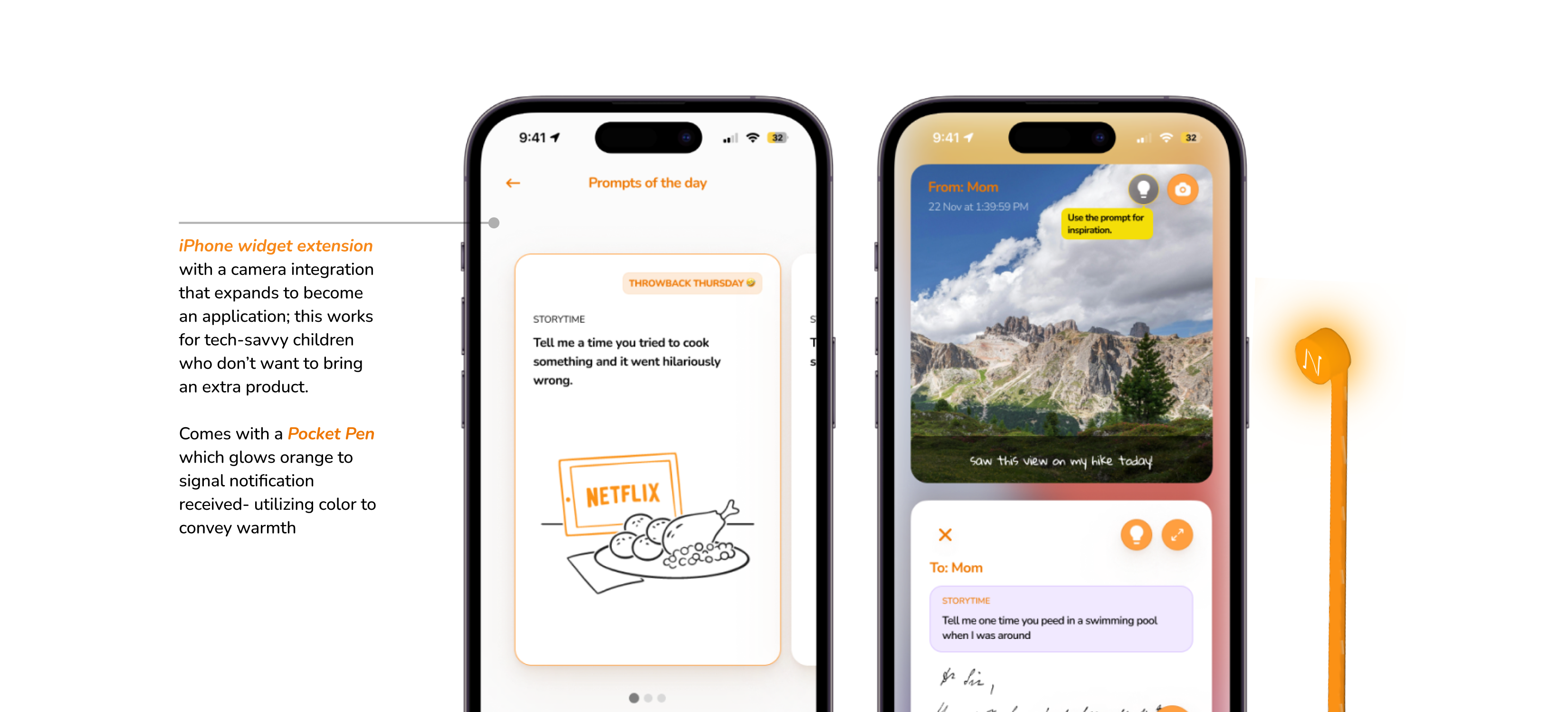
User Interface Style Guideline
The primary communication goal of the UI is to foster a sense of warmth and belonging, creating an approachable and easy-to-communicate space for users. The text styles are soft and rounded, enhancing the friendly tone, while the color palette is carefully selected to be visually soothing and appealing.
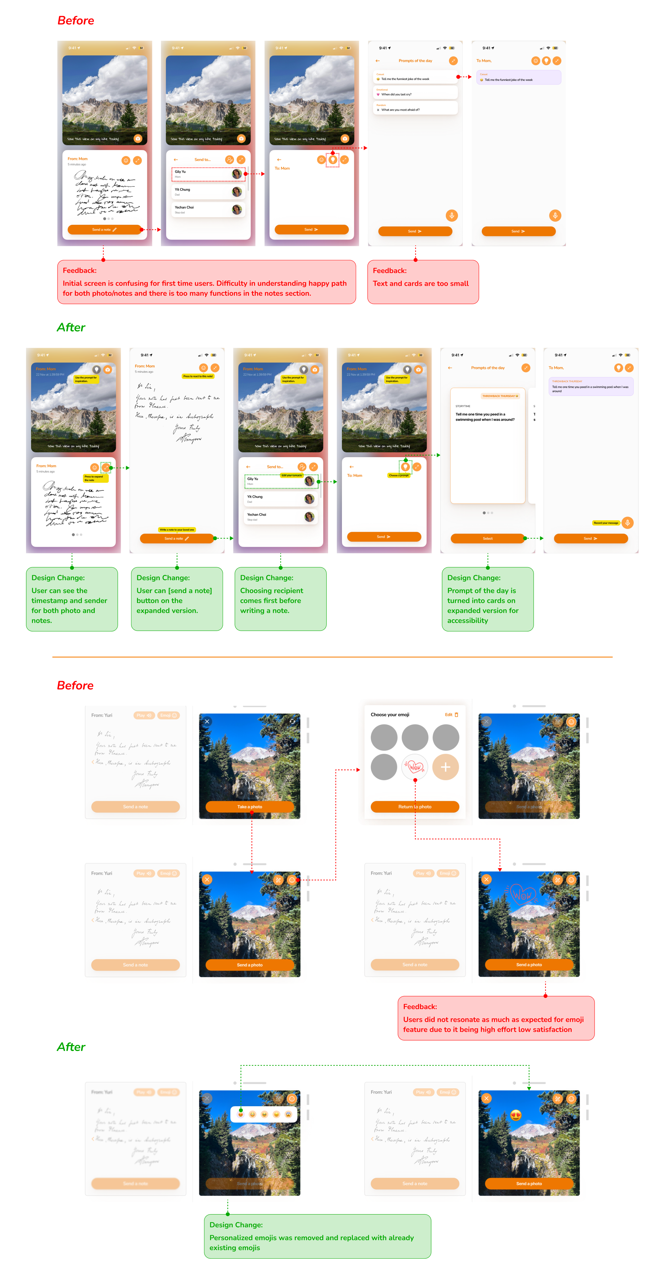
Usability Testing to Final Design
Usability testing was conducted on 2 parents and 3 working children. After synthesizing, we made the following changes to our designs, which helped us finalize our high-fidelity prototype.
Conclusion and Future Scope
In 10 weeks, we collaborated to produce an innovative way to connect families across both distances and work commitments. We believe we have made something remarkable that could really address a problem that affects families across the US.
We received largely positive feedback from user testing from both parents and children, and have indicated promise towards utilizing our concept. That is not to say that there aren’t issues with the design we’d like to improve, if given the time. User testing showed that emojis were not as important as we’d originally thought, for instance, but utilizing them to produce something relatable for both users (an inside joke, for example) showed interest among our user group.
For our future scope, we’d like to recommend exploring the aging parent-working child relationship to extend to logistics, feasibility, and a solidified idea on how our concept could benefit families across oceans as a tool to keep them connected.
Thanks for reading.