Rethinking the subscription mental model to boost conversion by 3.8%
Q1 2024 — Launch
KKCompany
Product Design
Usability Testing
PM*1
Engineering*3
Design*1 (Yit)
[Context]
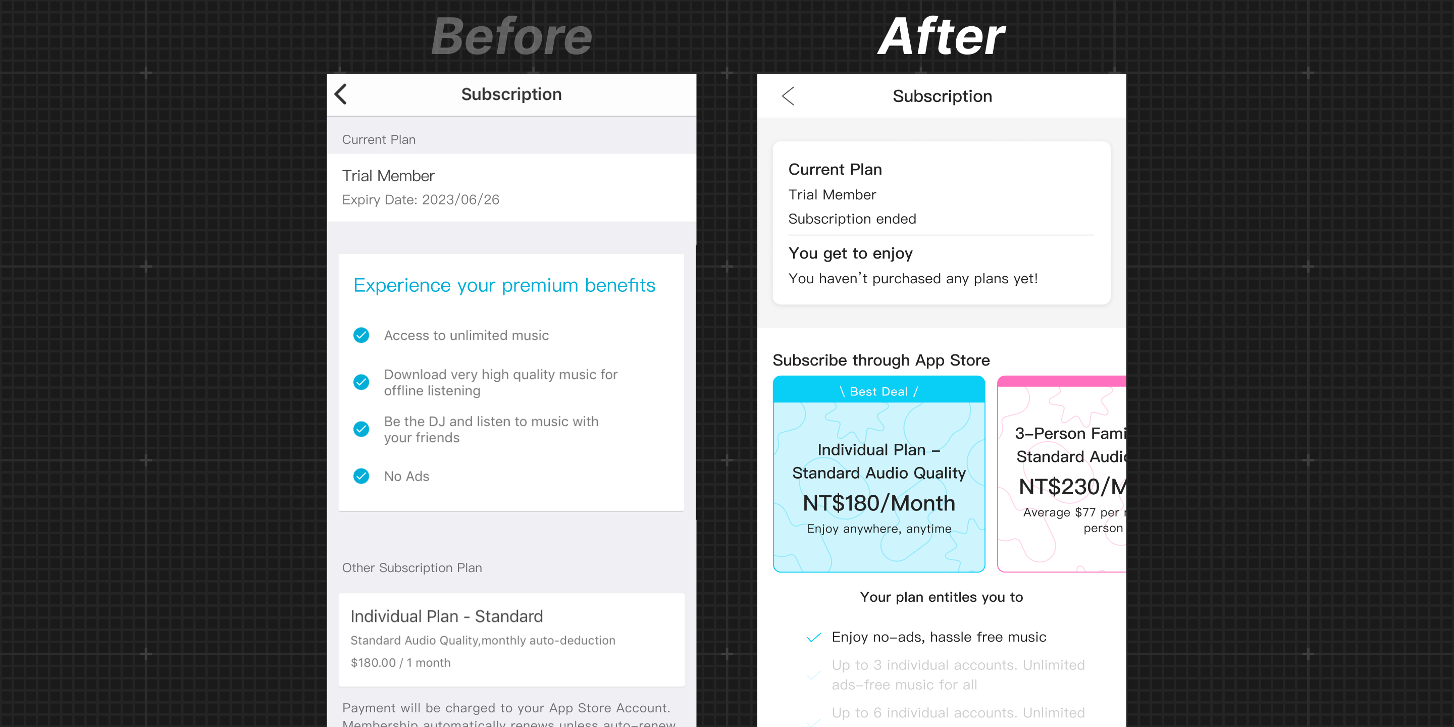
Turning a broken in-app purchase flow into a growth channel
Over 2 million users actively engaged with KKCompany’s music streaming app, yet most subscriptions occurred on the web — signaling that the in-app purchase experience was failing as a conversion channel.
I redesigned the end-to-end subscription structure and interface to restore in-app conversion as a growth lever. The new experience increased purchase conversion by 3.8% and drove 2,000 new Family Plan subscribers per month.
[Discovery]
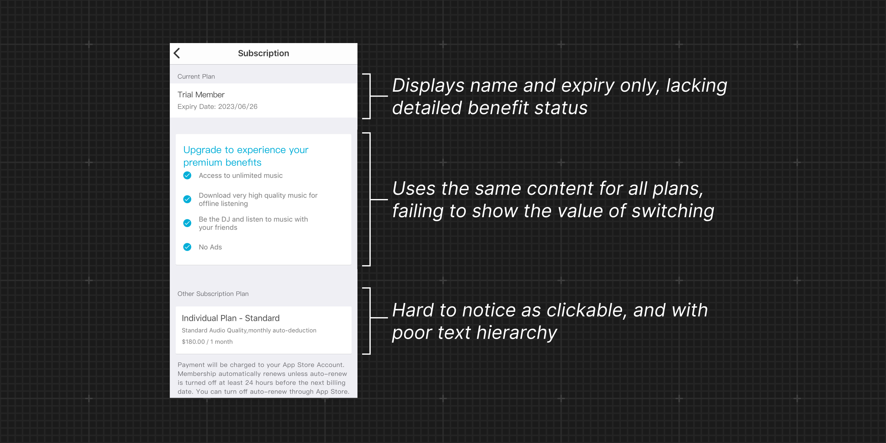
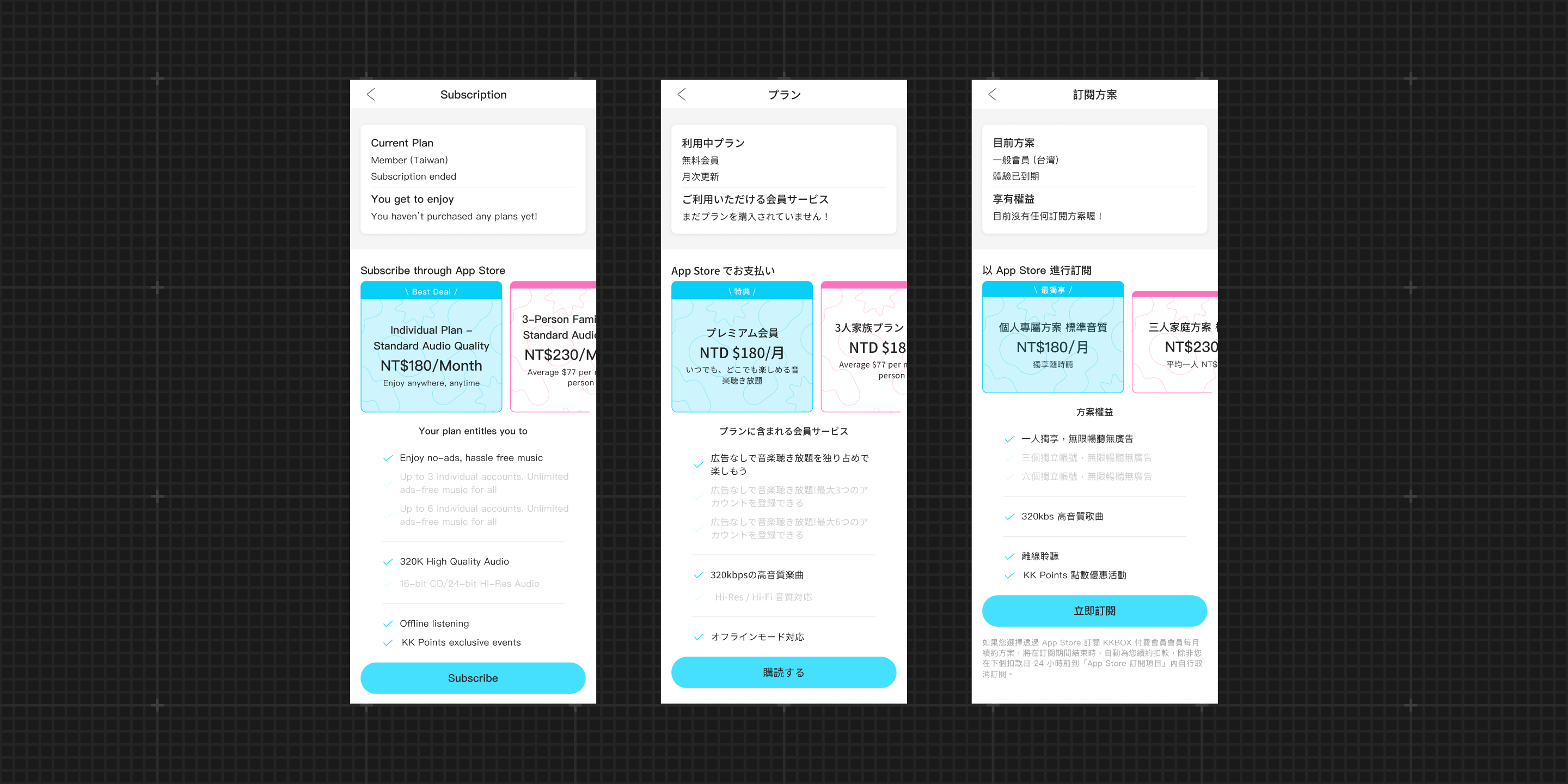
#1 Feels like account settings, not for managing subscriptions
A heuristic evaluation with six experts showed that the layout and visual cues could cause users to misinterpret their plan status and overlook where to change or compare plans.
#2 Too many plans for the app to handle
We offer 17 subscription options on the web. The complexity makes it difficult to present consistent choices across mobile and web, leading users to rely on the web as the primary place to subscribe.
[Solution]
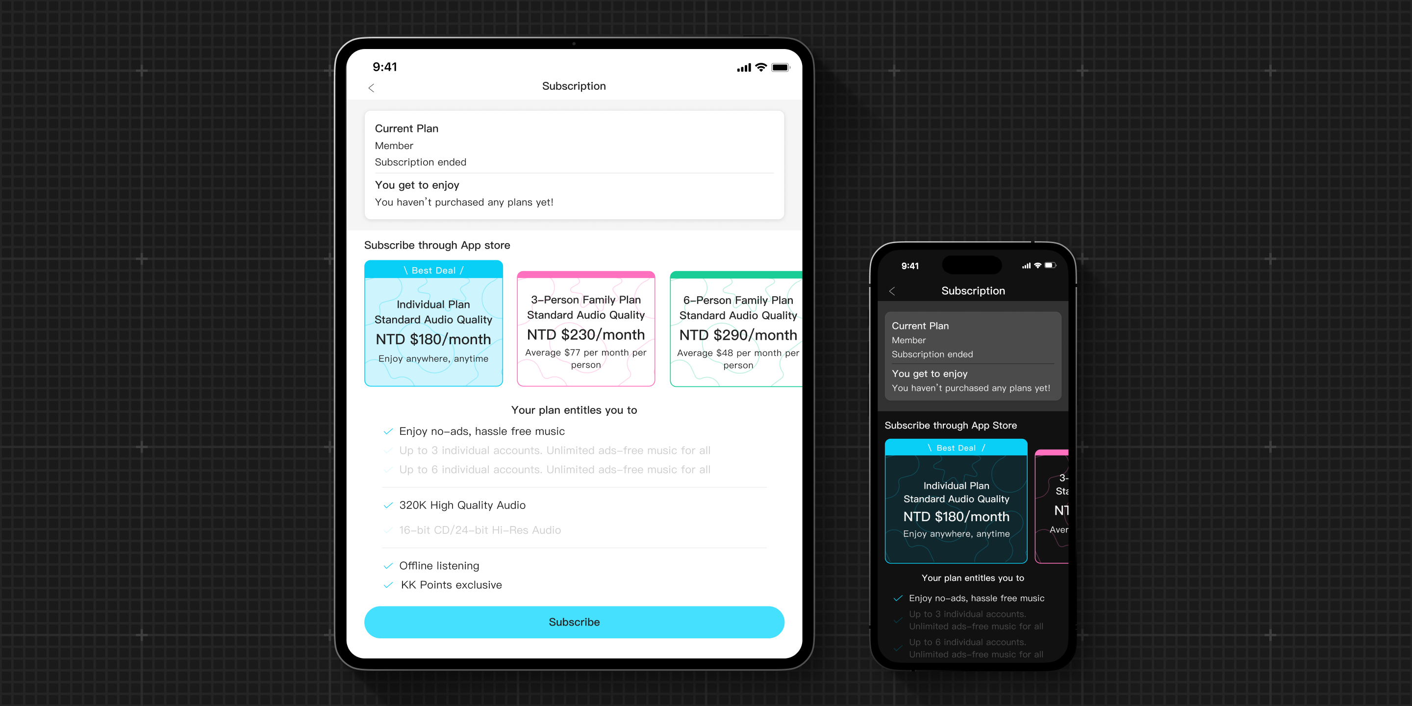
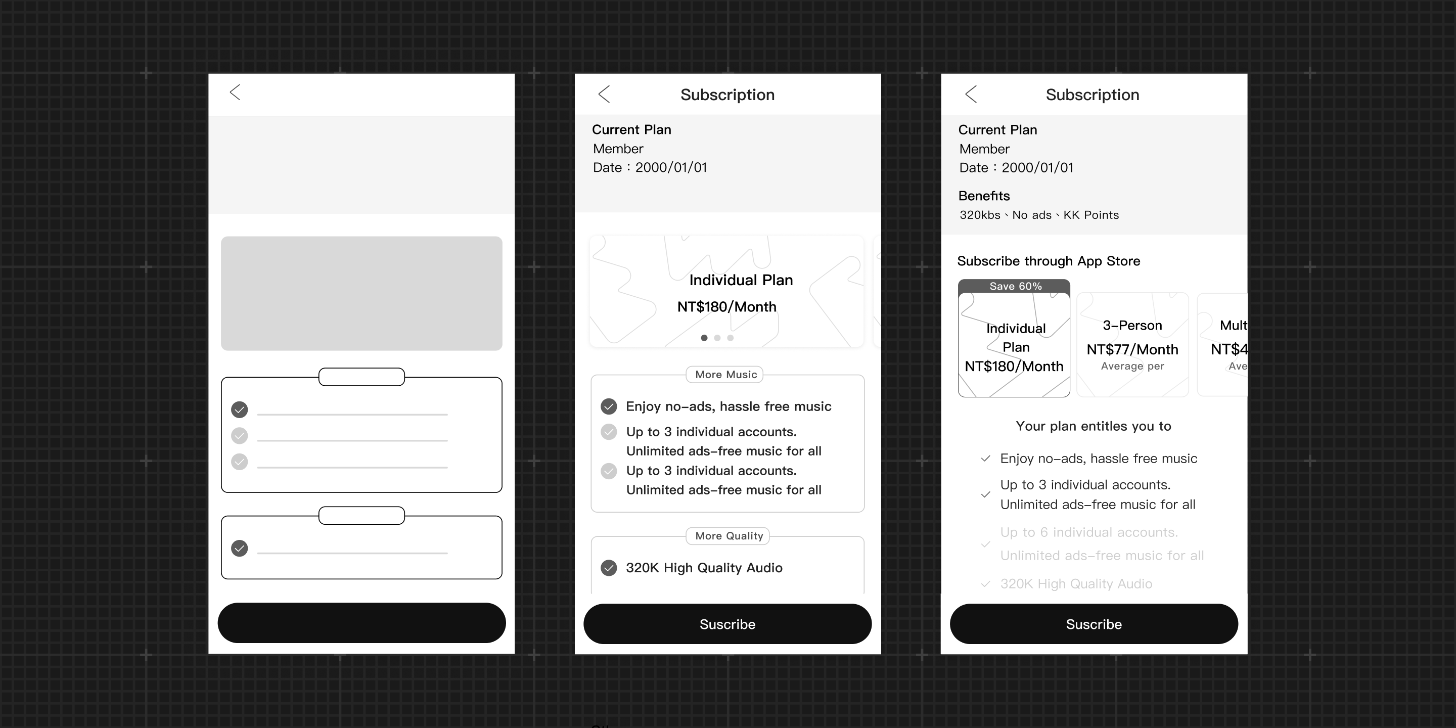
#1 Designing a subscription interface with clear intent
I restructured the information architecture to clarify what each section should communicate, and designed interactive plan cards with expandable details to make options easier to explore and compare.
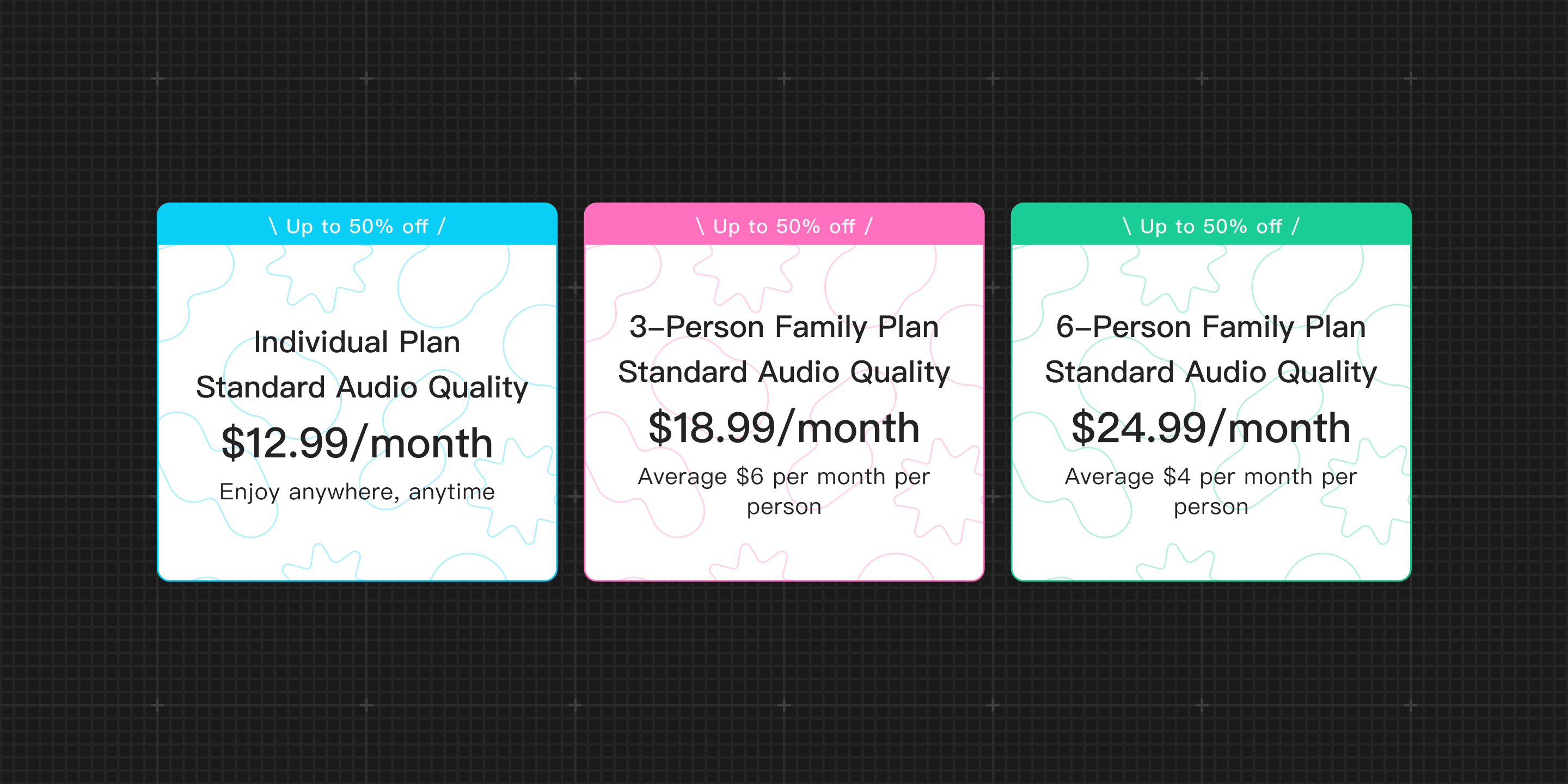
#2 Curating plans for the app experience
Recognizing that the app cannot accommodate all plans, I redesigned the plan cards into a horizontal, promotion-friendly layout and defined a curated set of featured plans for the app.
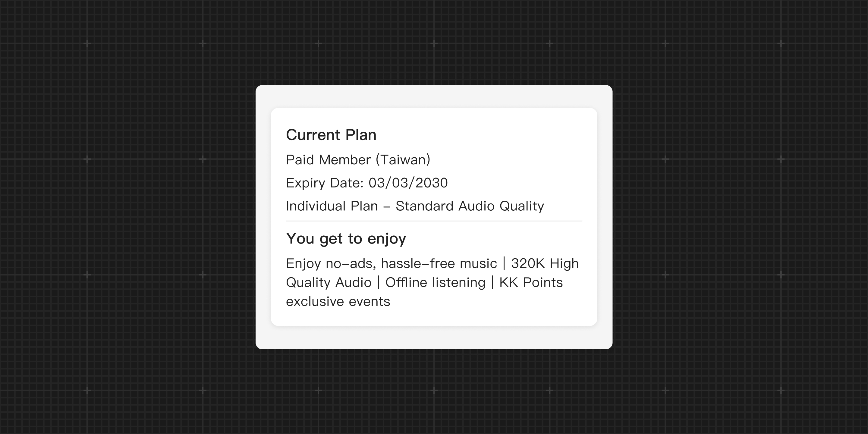
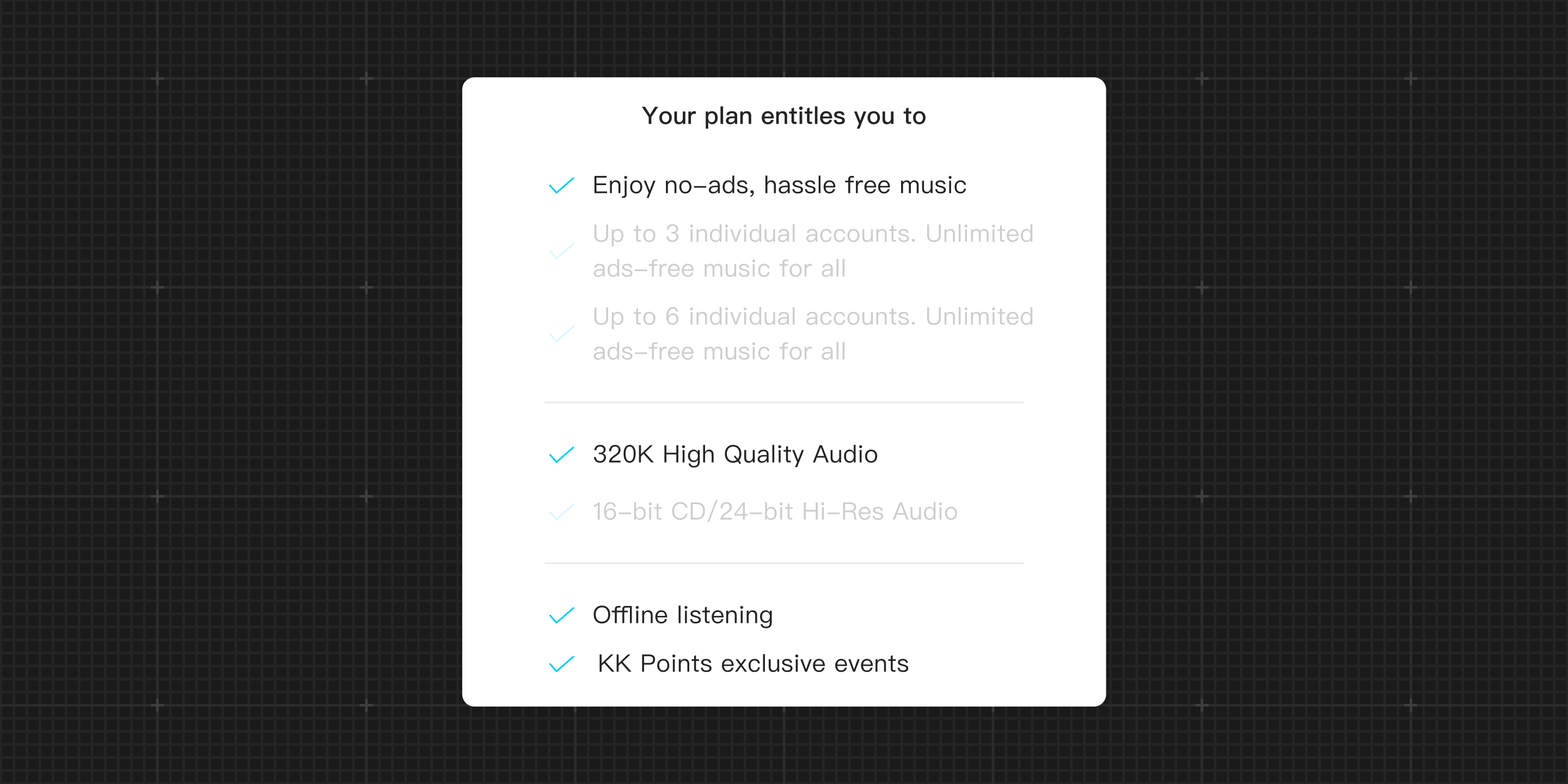
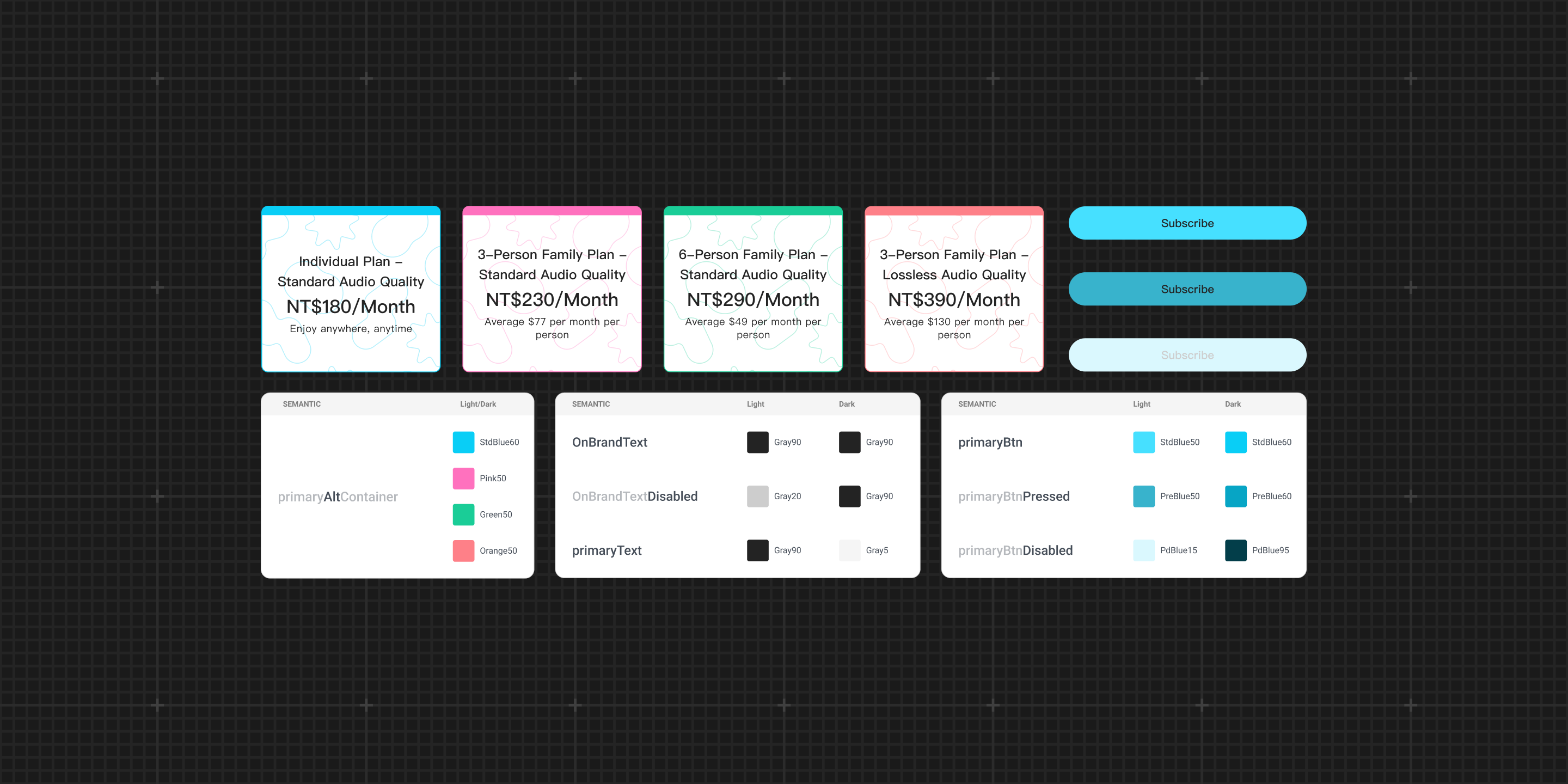
Detailed and transparent plan information
Provide users with clear insights into their current benefits, fostering better understanding and retention.
Visually appealing plan cards
Encourage users to explore other plan options with greater interest and ease, while allowing the team to conveniently expand offerings without increasing page length.
Accordion for Comparing Benefits
Reduce the text on the entire page by half and reveal comparable benefit details only when users interact with the section.
Usability Testing
Before development, I conducted usability testing on the redesigned flow and found that users were unsure what would change when switching tiers, causing hesitation and drop-offs. I introduced a popup to clearly explain benefit changes before confirmation.
[Delivery]
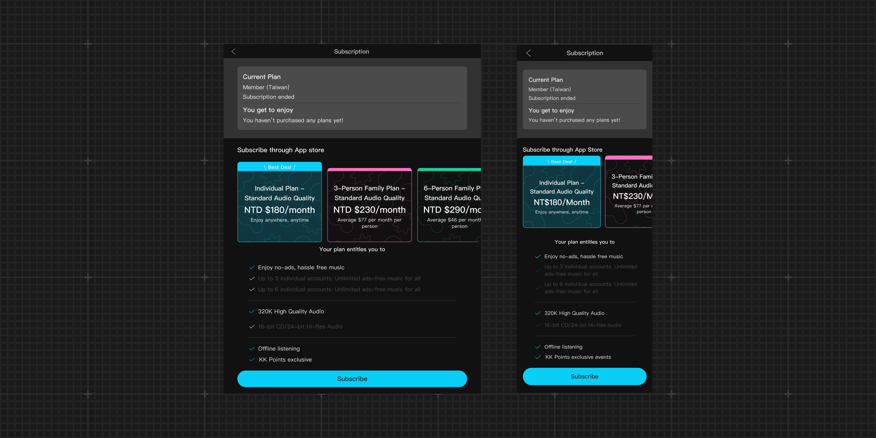
The new cross-platform subscription experience
I incorporated user feedback, refined high-fidelity screens, and finalized the visual system. The design accounts for light and dark modes, localization, and responsive layouts, balancing innovation with long-term maintainability.
[Reflection]
Unclear communication reduces trust in payment flows
Usability testing showed that unclear marketing copy and missing confirmation feedback made users hesitant and reduced their trust. This reinforced the importance of clear communication and micro-interactions in payment-related flows.
Scalable design reduces long-term design dependency
The card-based layout and flexible content structure enabled efficient updates. A new subscription plan was launched within a month without design involvement, demonstrating the system’s scalability.
Thanks for reading.