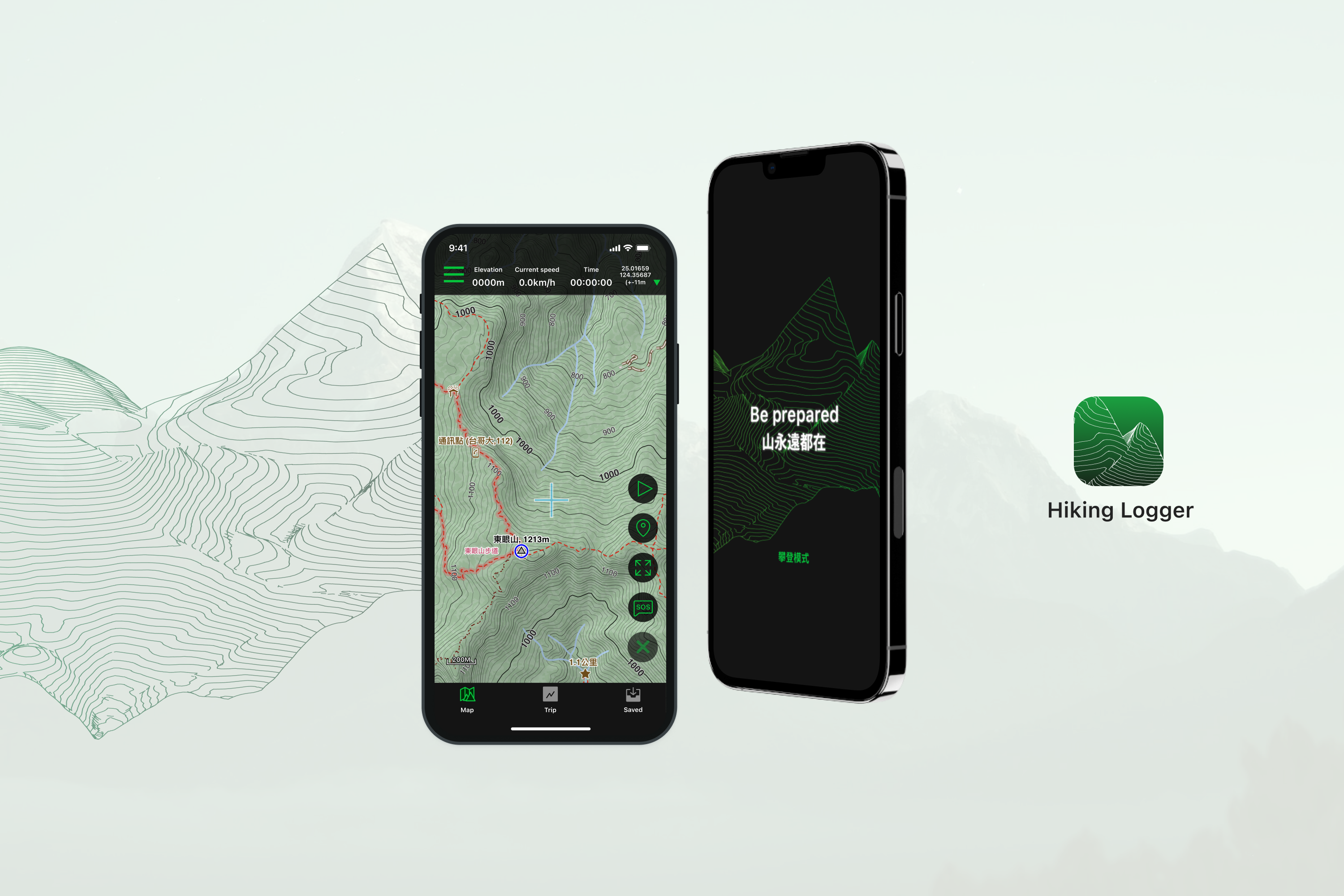
Hiking Logger Redesign
6 months
City West RCB Operation Dp.
UX Design
UI Design
Research
Usability Test
Yit (Design)
Rex (PM)
Outcome
80% of users were able to complete the assigned task directly or indirectly
For the assigned tasks, users generally find them very easy to complete
Ps. Based on a sample size of 20 participants
Background
Due to the impact of Covid-19, a hiking craze has swept across Taiwan's main island, leading the government to lower the threshold for applying to enter mountains with new legislation. However, this has also led to a 60% increase in mountain accident cases. As someone who has become enamored with this activity, I discovered that online professional hiking navigation products have a steep learning curve, and the newer products tend to prioritize community functions over detailed navigation planning to attract more users. As a result, I chose to redesign a professional hiking navigation product, aiming to create a user-friendly and expert-level hiking navigation tool.

Problem overview
Professional hiking navigation products typically avoid overly complex product planning for two main reasons. Firstly, these products are often developed by professional mountaineers themselves, which means that there is no hierarchical planning in the product design, with all functions presented on the same level. Secondly, overly complex designs can drain the phone's battery more quickly. However, this can result in a simplistic interface design, leading to a steep learning curve for users.
- #1 How might we adjust the product interface and workflow to make it easier for novice and intermediate users to use ?
- #2 How might we strike a balance between improving product experience and minimizing hardware power consumption ?
Fresh eyes audits
Task: Simulate a mountain climbing scenario and record a 50-minute track using the same mobile phone on three competing products. Then, conduct an audit on the following key processes:
- Database export and import process
- Track recording process
- Related data viewing process
- Error handling (e.g. network offline)
- Power consumption.
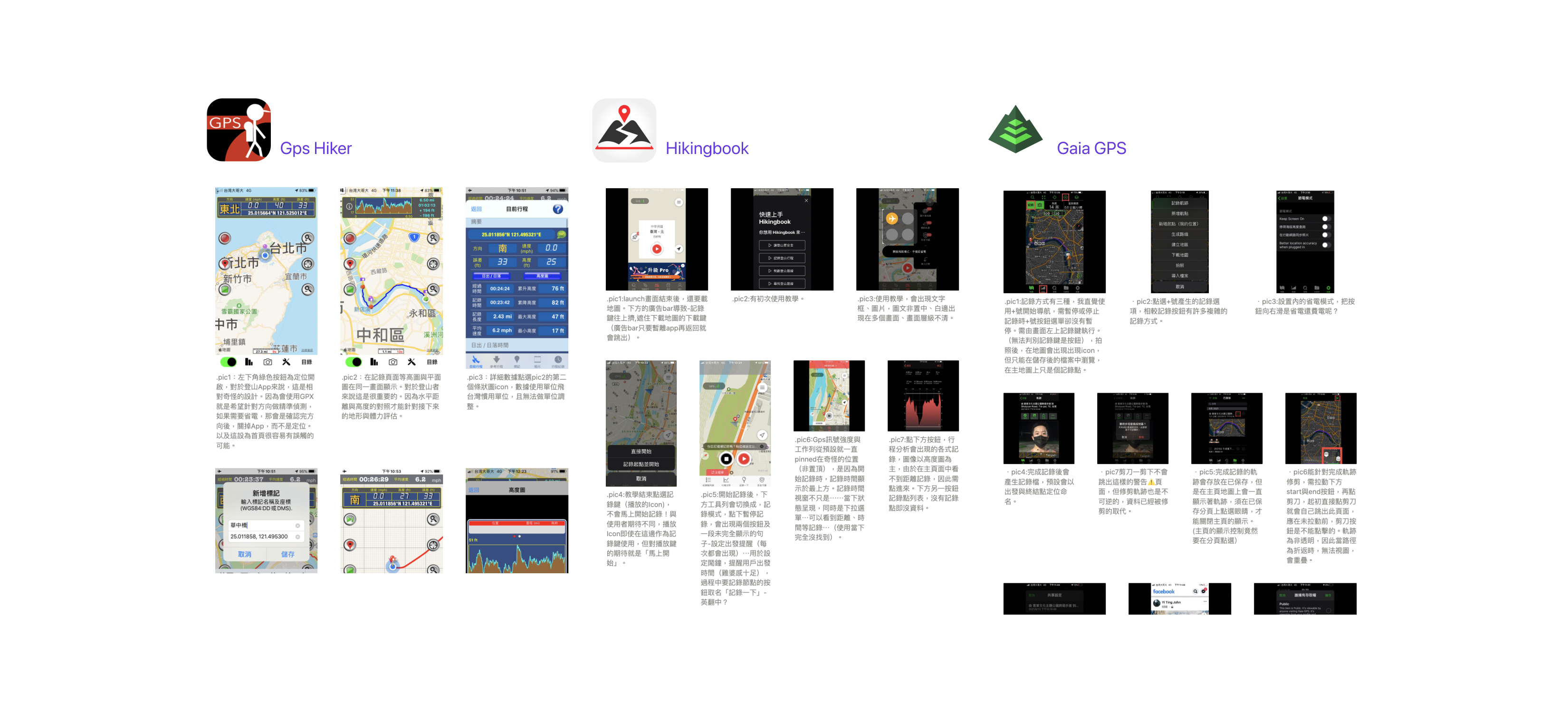

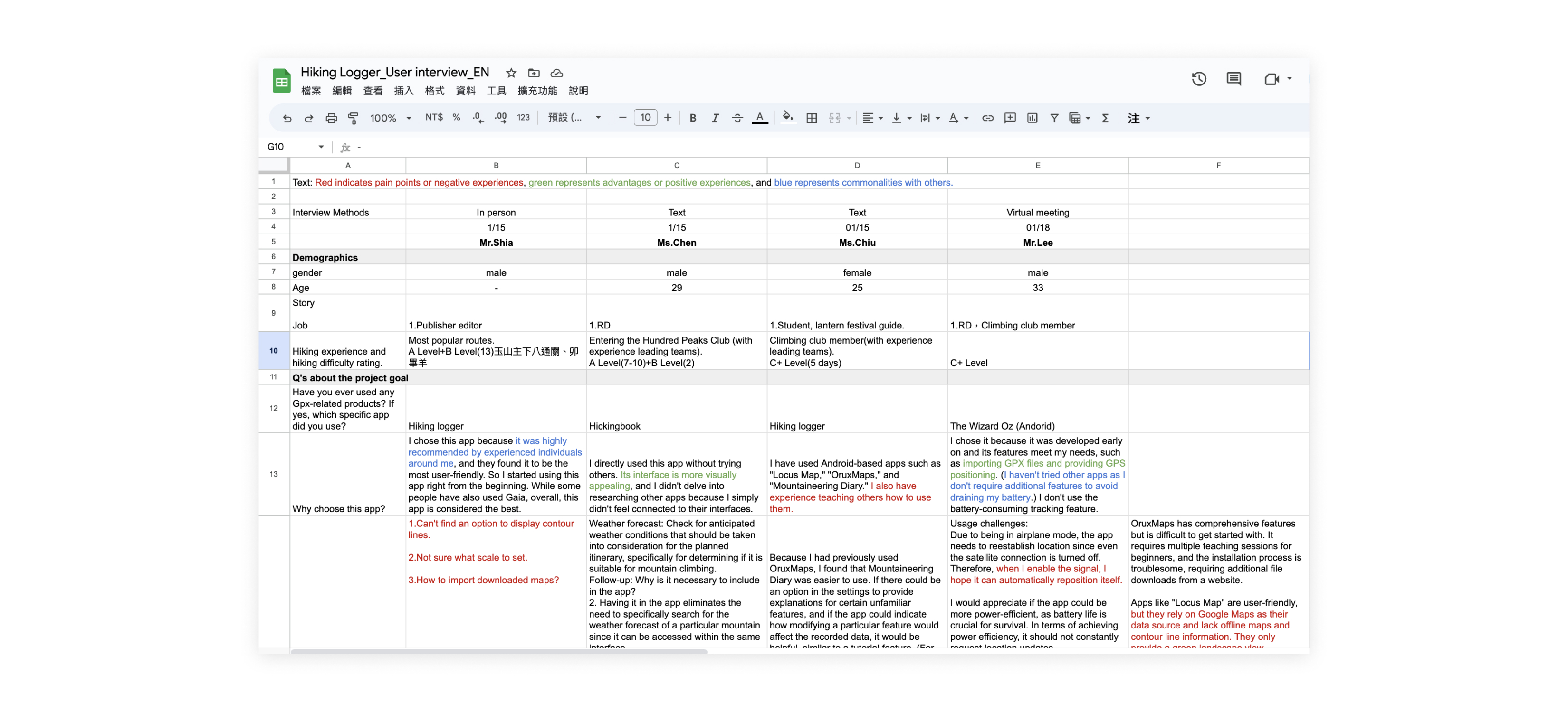
User interviews
I conducted a total of 5 interviews, three with intermediate-level hikers and two with professional-level hikers, and conducted in-depth interviews lasting between 40-60 minutes.The interview questions are mainly divided into two aspects:
- General direction questioning regarding the current use of mountain navigation products by the user.
- Detailed questioning regarding mountain planning and product operation. e.g. List the top five requirements for hiking navigation products based on their importance to you and rank them.
And classify the responses into positive statements, negative statements, and common statements shared by other interviewees.
Recap HMW and make the Design goal
- #1 HMW adjust the product interface and workflow to make it easier for novice and intermediate users to use ?
First, the ability to evaluate climbing skills is difficult, and the grading relies on self-awareness. Therefore, the product functions should be categorized into basic and advanced functions based on user interviews, the learning curve can be lowered. The primary interface should satisfy most use cases and user needs, with advanced or lesser-used functions available in secondary interfaces.
- #2 HMW strike a balance between improving product experience and minimizing hardware power consumption ?
Reducing unnecessary effects and functions can reduce power consumption, but this may also lower user interest. It is important for navigation products to consider power consumption as a design responsibility. A possible compromise could be to selectively disable power-hungry functions during hiking scenarios.
Key pathways
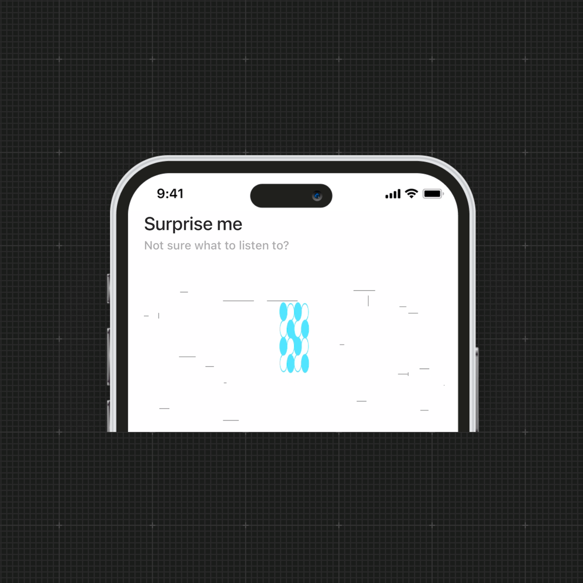
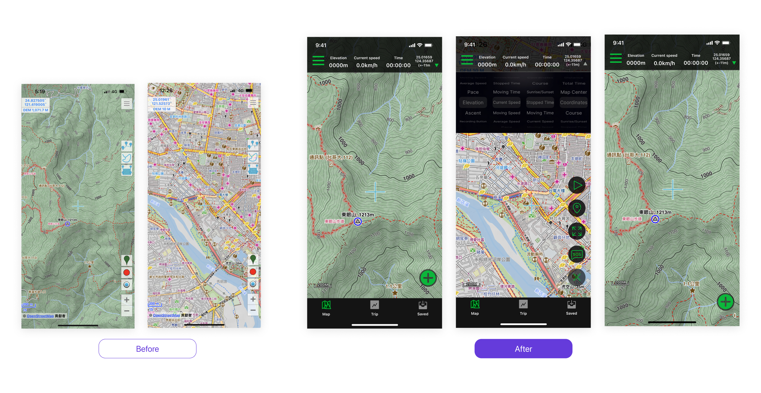
Portal page
- According to the principle of Hick's Law, we have redesigned the interface to decrease cognitive load by separating the functions originally presented on the first layer into top navigation, bottom navigation, and a floating action button.
- Creating a visual hierarchy of elevation levels by using overlays and shadows on the map and operational components.
- Add a full-screen map function and hide the bottom navigation to provide users with a larger map viewing area.
- The definition means to use green as the accent color to emphasize important elements.
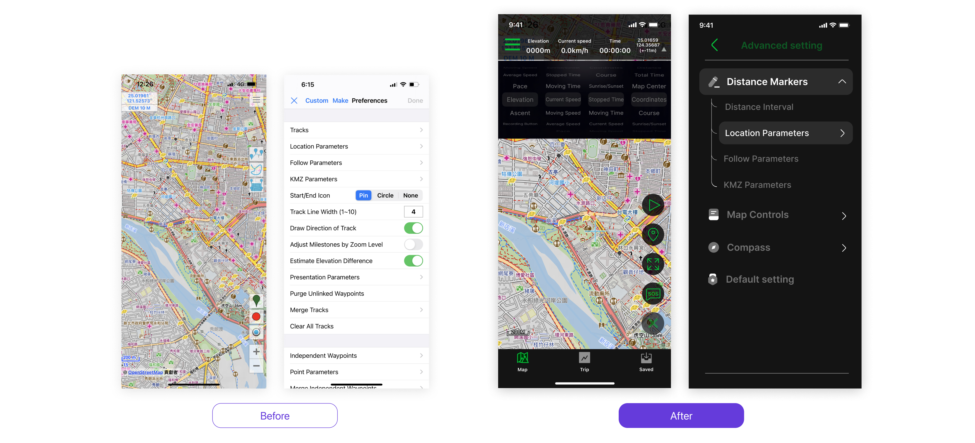
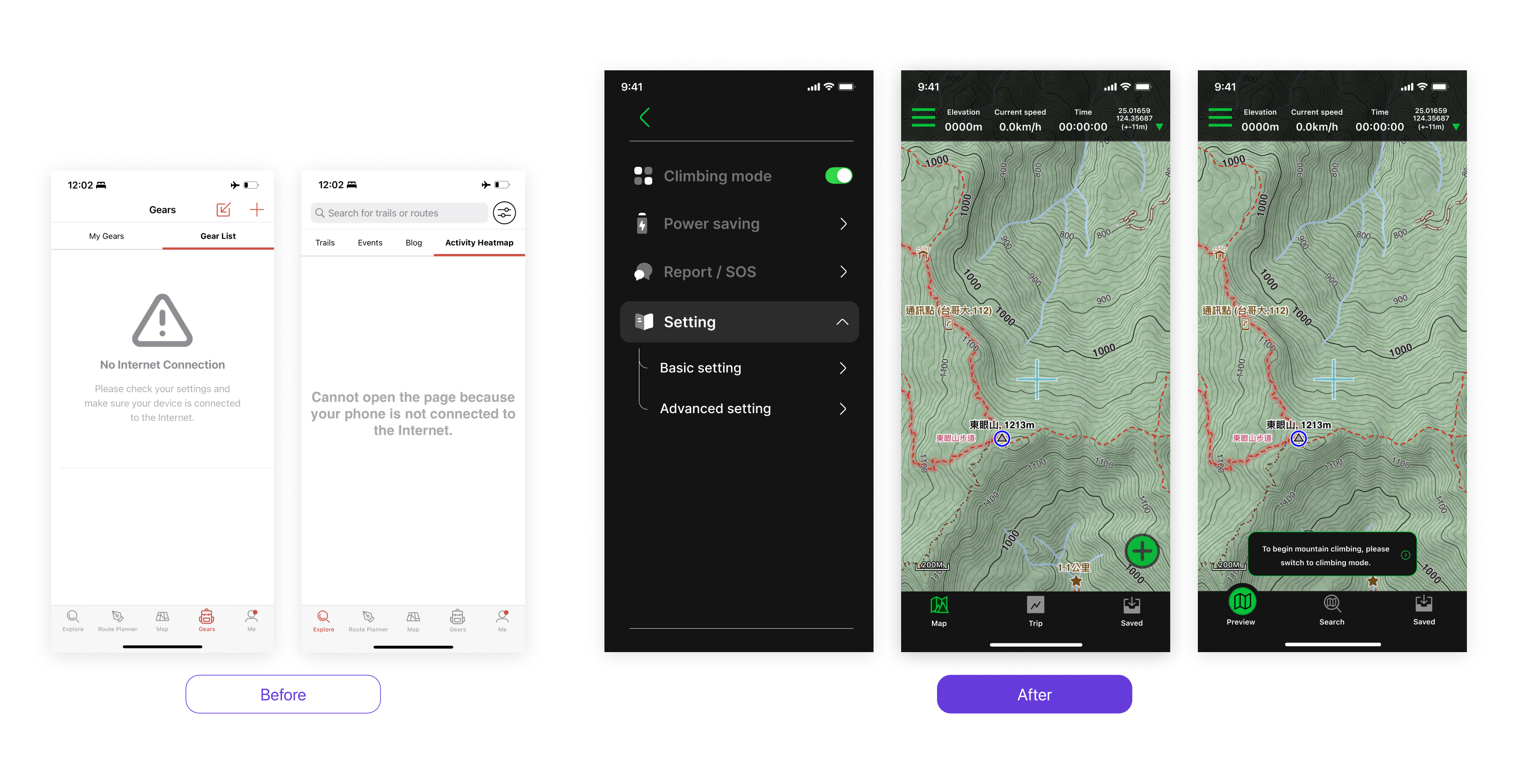
Setting page
- Divide the settings into basic and advanced options, and provide a reset to default feature to reduce the learning curve and allow for trial and error.
- Provide a power-saving mechanism that offers users several high-energy-consuming feature options to be disabled when needed.

Switching between search and climbing modes
- The community page for user-generated content in mountain climbing often has 2-3 tabs that show error pages due to the mountain environment. This results in users trying to refresh and consuming more power. The multiple error pages also create a negative user experience.Therefore, we provide mode switching and toast reminders to ensure that users operate the product in the correct environment.
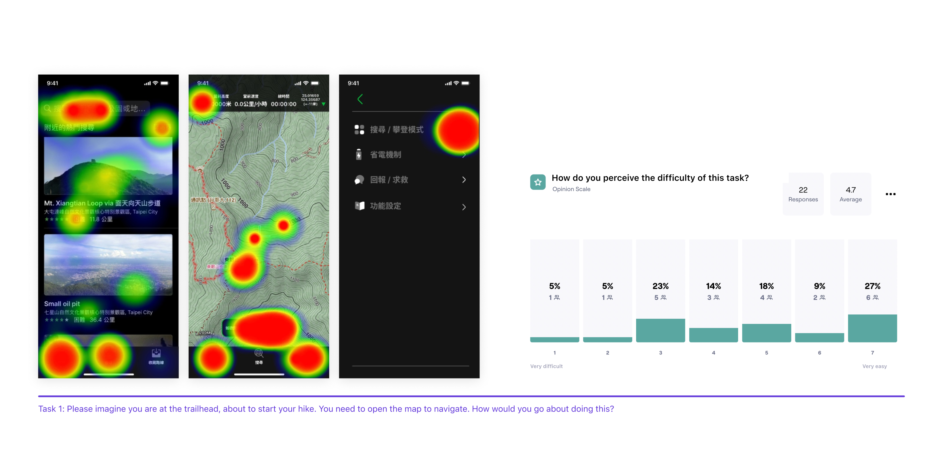
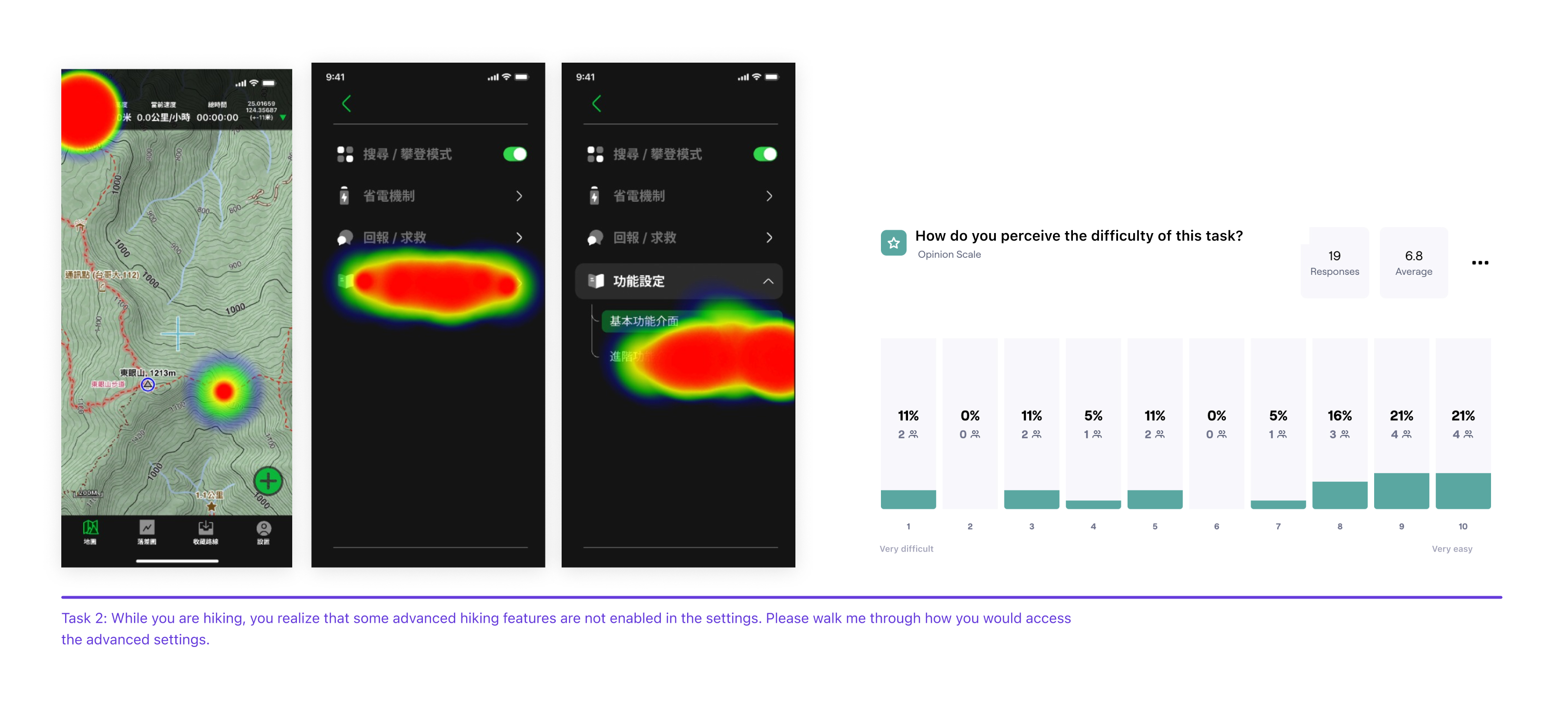
Online Usability test
- Insight1. In the test results for Task 1, 76% of participants completed the task, but 46.7% of them completed the task using an indirect path instead of the designated route. The task received an average score of 4.7 on the SEQ, indicating a relatively difficult task for users.
- Insight2. In the test results for Task 2, 80% of participants completed the task, but 42.9% of them completed the task using an indirect path instead of the designated route. The task received an average score of 6.8 on the SEQ, indicating a relatively easy task for users.
Improvement
The operation method on Task 1 is uncommon, and physical usability testing should be adopted
Based on user feedback, it was found that the switching operation required in mountain climbing is not understandable to users, and therefore, on the heat map, it can be observed that users may guess and make incorrect actions. Since the usability test was conducted online through a questionnaire, it is difficult to determine the actual state of the users, which may cause inaccuracies in the test results.However, this also suggests that uncommon features like this should have tooltips designed to educate users on how to operate them.
Thanks for reading.