[Copy] Revamping a Subscription Experience.

2 months; Launched
KKCompany
UX Design
UI Design
Usability Testing
PM*1
Engineering*3
Design (Yit)
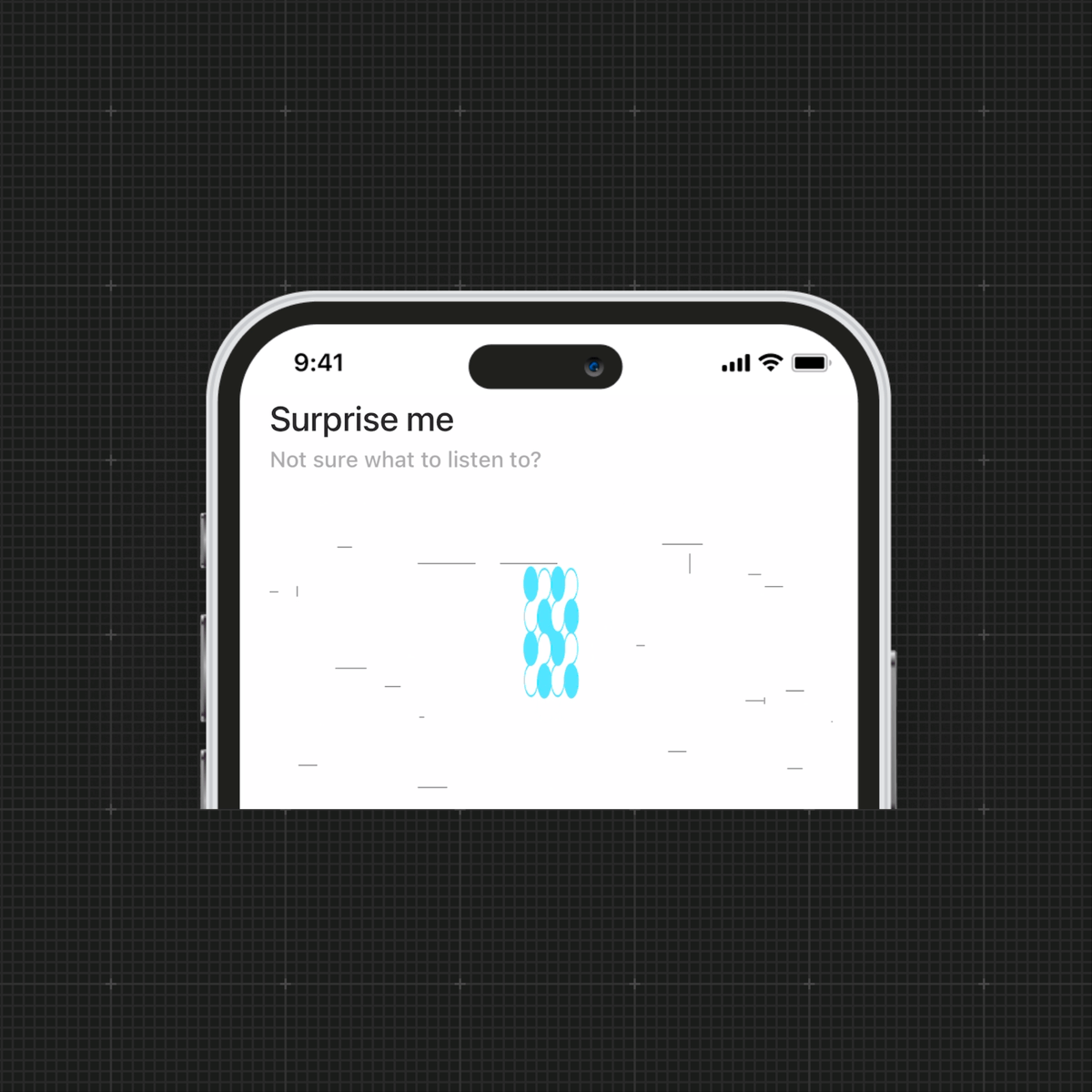
How I increased the purchase conversion rate by 3.8% in 2 months?
KKBOX, KKCompany's flagship product, is a cross-platform music streaming application.
Over time, the product developed various purchasing options and user plans, but these alone weren't enough to drive revenue growth in a competitive market. The marketing team turned for design support, and I simplified complex processes by integrating business and user needs, ultimately boosting revenues.
I began with competitive research and heuristic evaluation to identify usability issues and collaborated with data analysts to assess their severity. I then led design sprints to ideate, prototype, and conduct hallway usability testing, iterating based on feedback.

Problem
Low effectiveness of in-app subscriptions.
Most subscriptions happen on the website, not in the app — despite the app being the primary user touchpoint. The app’s outdated structure makes plans difficult to manage internally and difficult for users to understand, compare, and subscribe.
Solution
Creating a delightful and scalable experience to boost engagement and efficiency.
The new subscription experience (1) clarifies the information structure, (2) provides a visually compelling interface, and (3) enables teams to easily add new plans.
Discovery
#1 Too many plans for the app to handle
We offer 17 subscription options on the web. The complexity makes it difficult to present consistent choices across mobile and web, leading users to rely on the web as the primary place to subscribe.
#2 Feels like account settings, not for managing subscriptions
A heuristic evaluation with six experts showed that the layout and visual cues could cause users to misinterpret their plan status and overlook where to change or compare plans.

#3 Users spend 12 seconds on the subscription page on average.
Before designing anything, I wanted to confirm the need for a major revamp. Collaborating with business analysts, I found that users quickly exited the page, suggesting the design failed to meet expectations upon arrival.

The main insight
The subscription experience should be user-friendly for both users and the product team.
Based on data trends and evaluation results, I proposed:
- Improving content structure and writing to help users quickly find key details.
- Restructuring the visual layout to clearly communicate that the page is designed for subscription.
- Enhancing interface scalability to ensure easier management for future updates.
Ideating Solutions
Making the app subscription experience just like shopping!
As I began brainstorming possible solutions, I drew inspiration from the 'shopping experience,' aiming to make it enjoyable for users to find the most suitable plan.
I clarified users' motivations at each stage of their journey and designed relevant features to seamlessly connect the process, while also considering technical limitations to ensure feasibility.
Eventually, this concept evolved into designing pages that guide users through three key stages: (1) Before Shopping, (2) During Shopping, and (3) After Shopping.

Iterations
3 major improvements.
Based on feedback, the designs continue to improve.
- Narrowing down the use of color, applying it only to the subscription plan cards. Initially, I used various colors to highlight information, but I received feedback that the previous designs were overly colorful, making it difficult for users to focus on selecting a plan.
- Enlarging the space between modules. Since this page is filled with a large amount of text, the use of negative space makes related information visually easier to read.
- Hiding the comparing details with an accordion design. With three key stages on the screen, balancing the proportions makes it easier for users to find the right features.

Hallway Usability Testing
+1 more major improvement.
Before development, I conducted usability testing to validate the usability of different tiers pathways.
- Appropriately adding contextual triggers (popups and automatic redirection). I received feedback that users felt unsure about the next steps when subscribing to a Family Plan or changing tiers, resulting in a lack of trust or abandoned subscriptions.

1. Detailed and transparent current plan information.
Provide users with clear insights into their current benefits, fostering better understanding and retention.
2. Visually appealing horizontal plan cards.
Encourage users to explore other plan options with greater interest and ease, while allowing the team to conveniently expand offerings without increasing page length.
3. Readable Visual Hierarchy.
Adjust the proportions of fonts, colors, and icons to visually guide users, making it easier for them to locate the information they need.
4. Accordion for Benefits Information.
Reduce the text on the entire page by half and reveal comparable benefit details only when users interact with the section.
The Final Design
The new subscription experience.
The key aspects of this revamp include reorganizing the information layout to help users better understand the benefits and the purpose of each section. I also incorporated brand-style illustrations to make the comparison process feel more like shopping. Lastly, I used card and accordion designs to support expanded plans and reduce users' reading burden.

More details...


Key Takeaways
What I'd learned from this design process.
Strengthening user trust through design
During usability testing, we discovered that the lack of task completion pop-ups and unclear marketing copy caused users to feel hesitant and reduced their trust in the product. This highlighted the importance of focusing on micro-interactions and clear communication, especially when designing processes related to payments.
The advantages of scalable design
The redesigned subscription page used a card-based layout with flexible content areas and consistent backgrounds, enabling efficient updates. For example, a new subscription plan was launched within a month without design team involvement, showcasing the scalability of the design.
Thanks for reading.