Reframing a freemium experience to increase session duration by 42 min
2 Months · Launched Q3 2024
KKCompany & KDDI Corporation
Product Design
PM*1
Engineering*2
Design*1 (Yit)
[Context]
From passive utility to a proactive growth funnel
Our platform is a multi-service subscription ecosystem that integrates music, e-books, and shopping into a single interface. Within this high-traffic environment, the freemium music feature was barely being used. Sessions were short, and the player failed to bridge the gap between casual browsing and the premium music service.
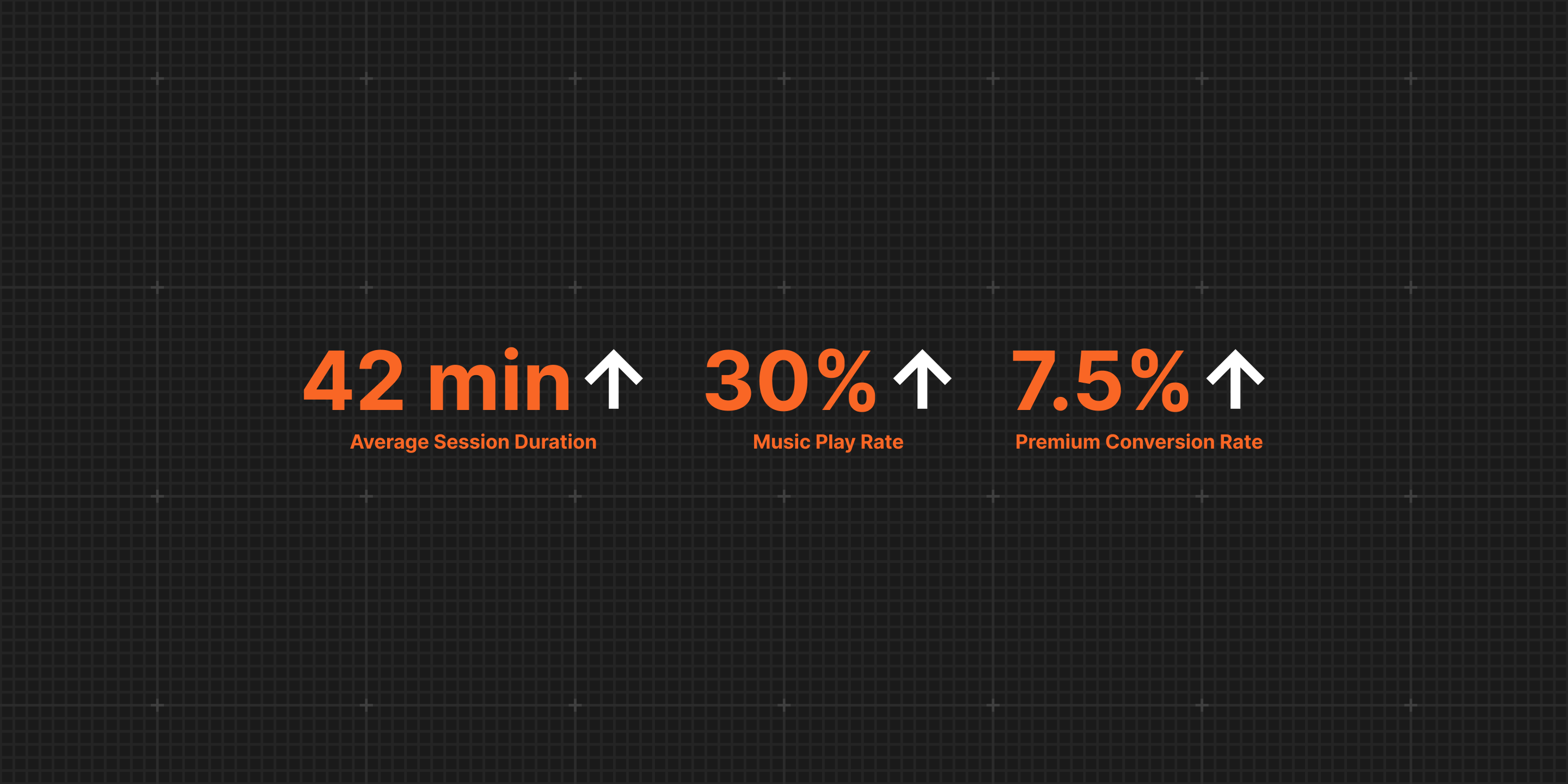
I redesigned the end-to-end playback experience and notification system, transforming a passive utility into a proactive funnel. The new experience raised average session duration from 79 to 121 minutes (+42 min), increased music play rate by 30% (from 5% to 35%), and lifted premium conversion by 7.5%.
[Discovery]
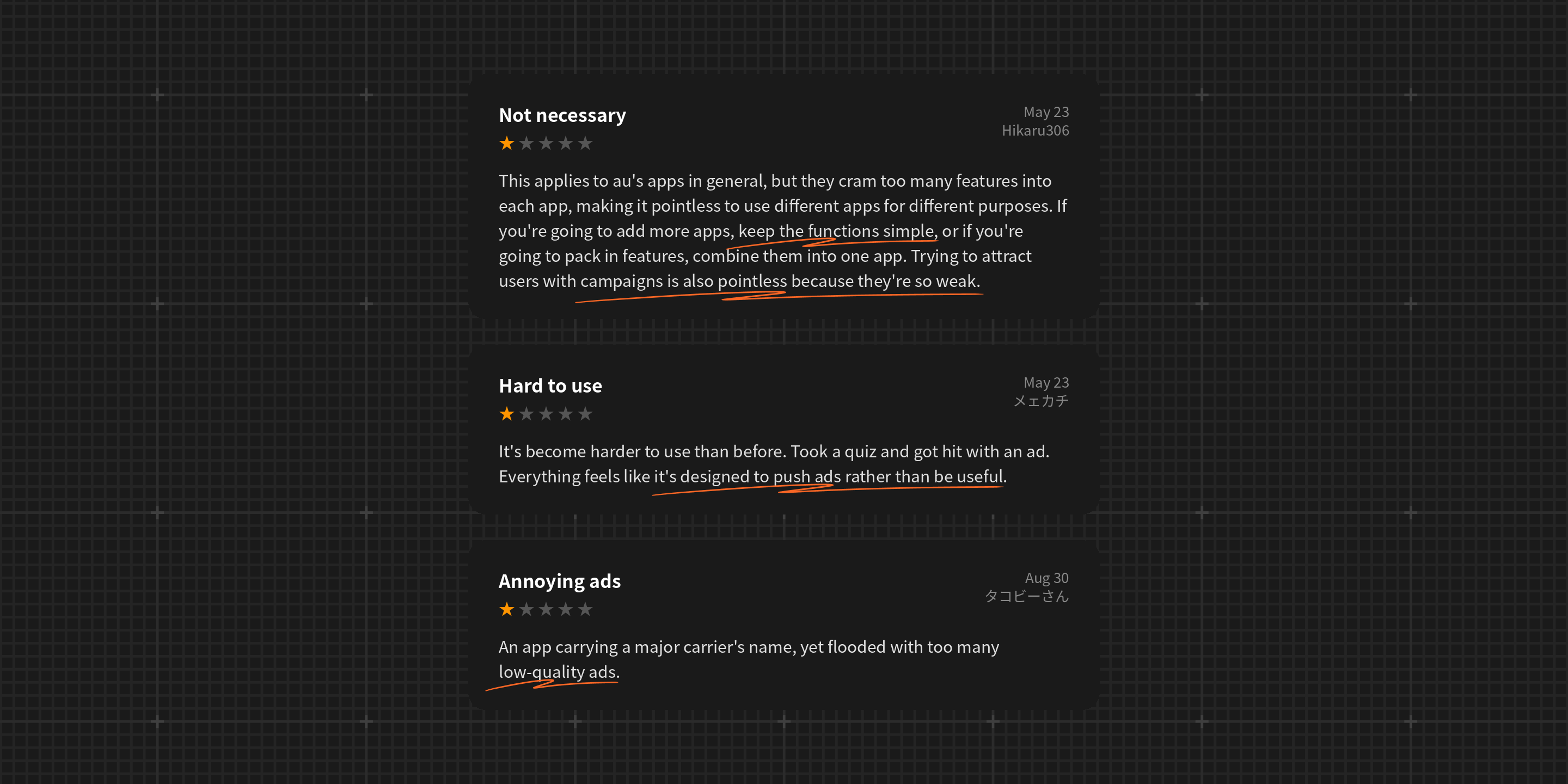
App store reviews and competitive analysis revealed three issues preventing the freemium music feature from functioning as an effective engagement and monetization surface.
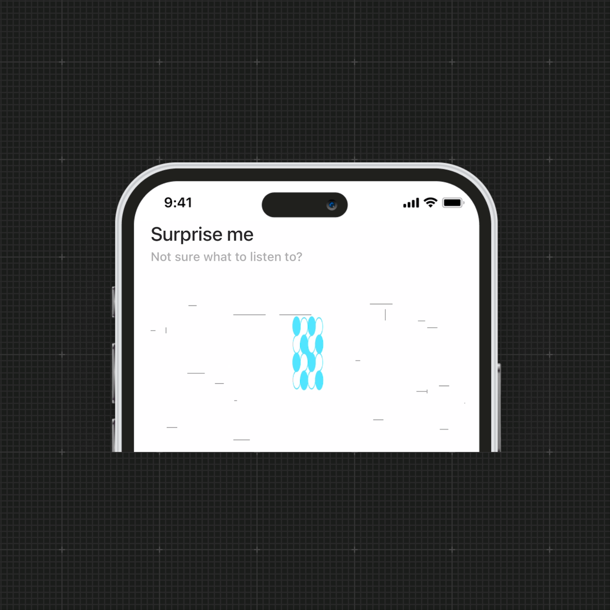
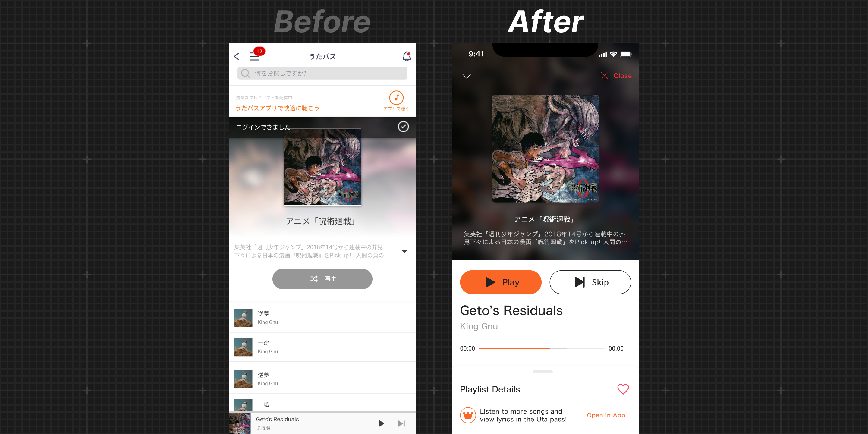
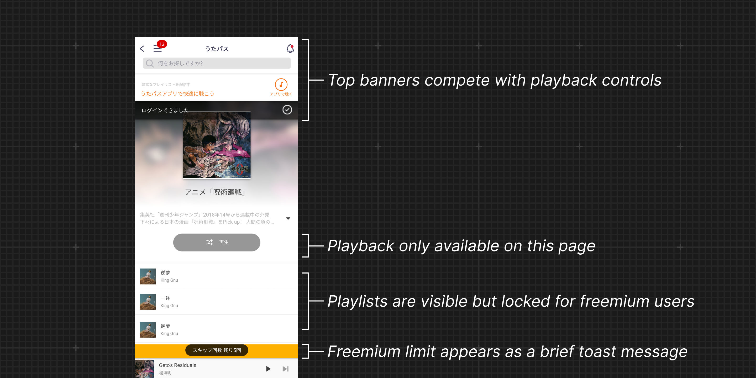
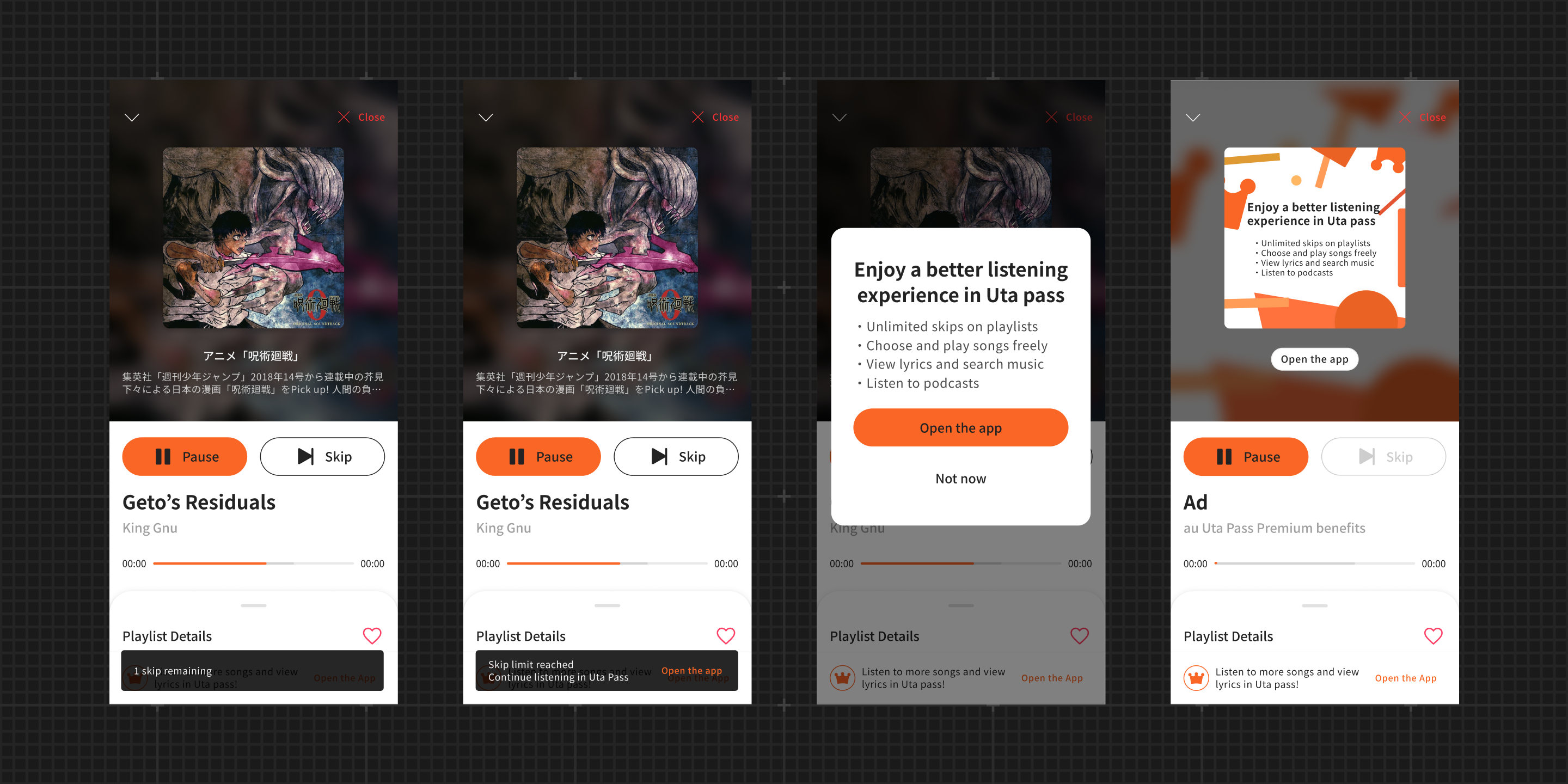
#1 The player page emphasizes ads over playback
Banners and unclickable playlists pull attention away from playback, making it harder for users to start listening.
#2 Freemium limits are surfaced as ineffective notifications
Users only learn about restrictions through short toast messages that provide little context or guidance.
#3 Listening stops when users leave the player page
Playback only continues within the player page, interrupting listening when users navigate elsewhere in the app.
[Design Strategy]
Enable clear and persistent music playback
I aimed to make music easier to start, control, and continue across the app by clarifying playback interactions and supporting continuous listening.
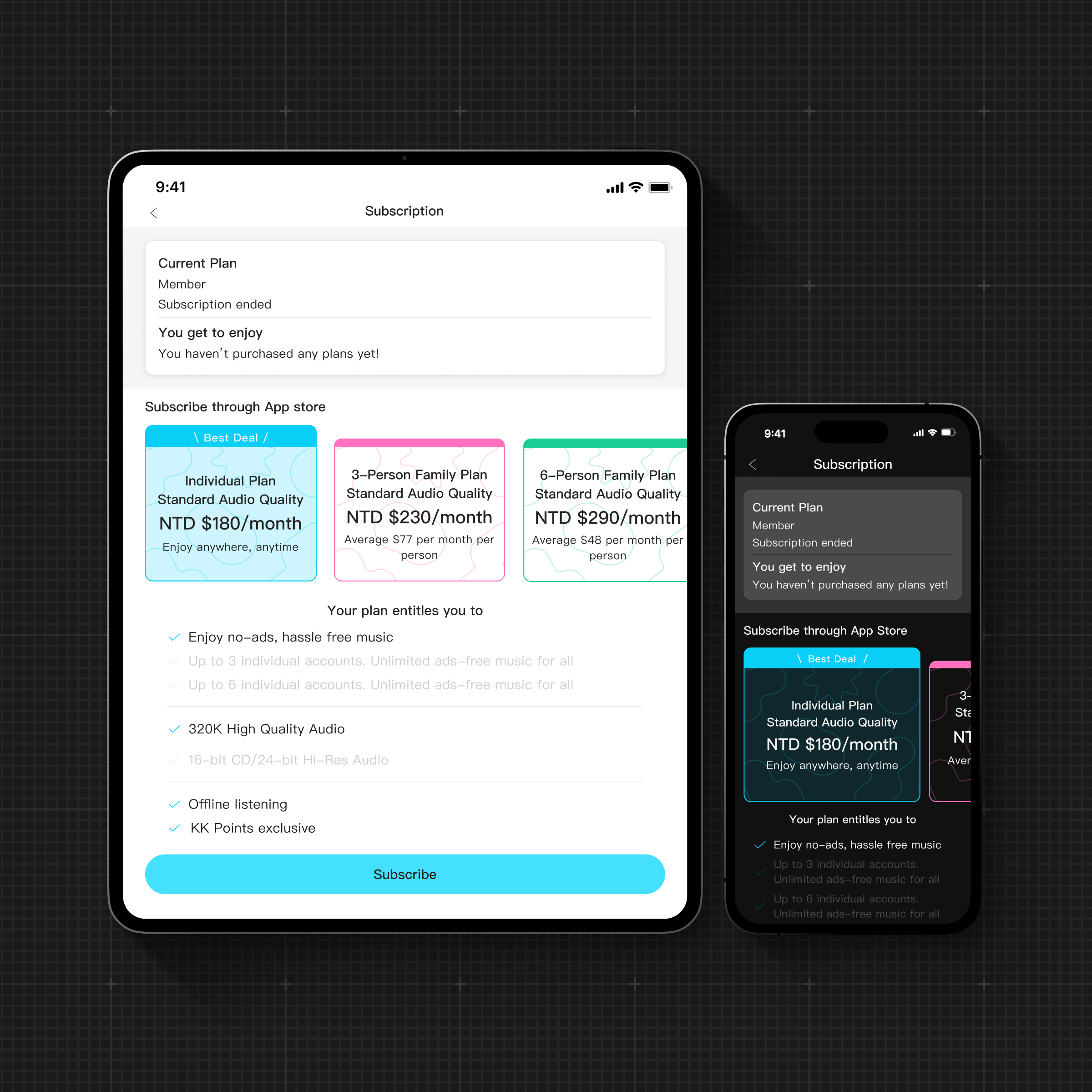
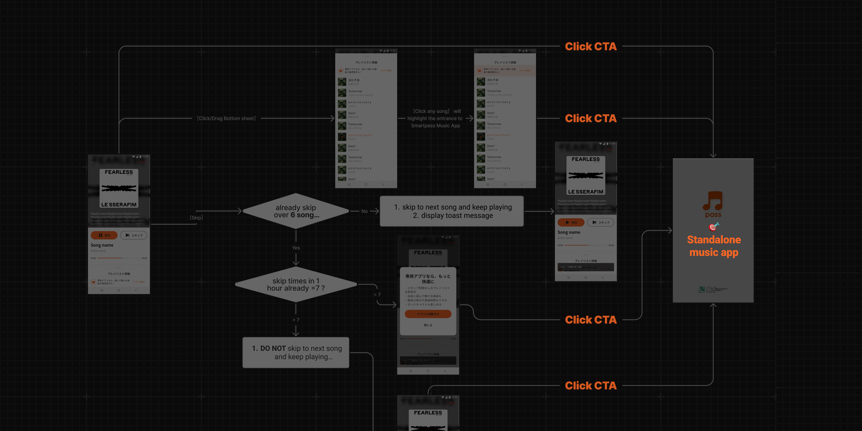
Plan contextual conversion interactions
I mapped key user flows to identify where freemium limits occur and defined conversion touchpoints that inform rather than interrupt.
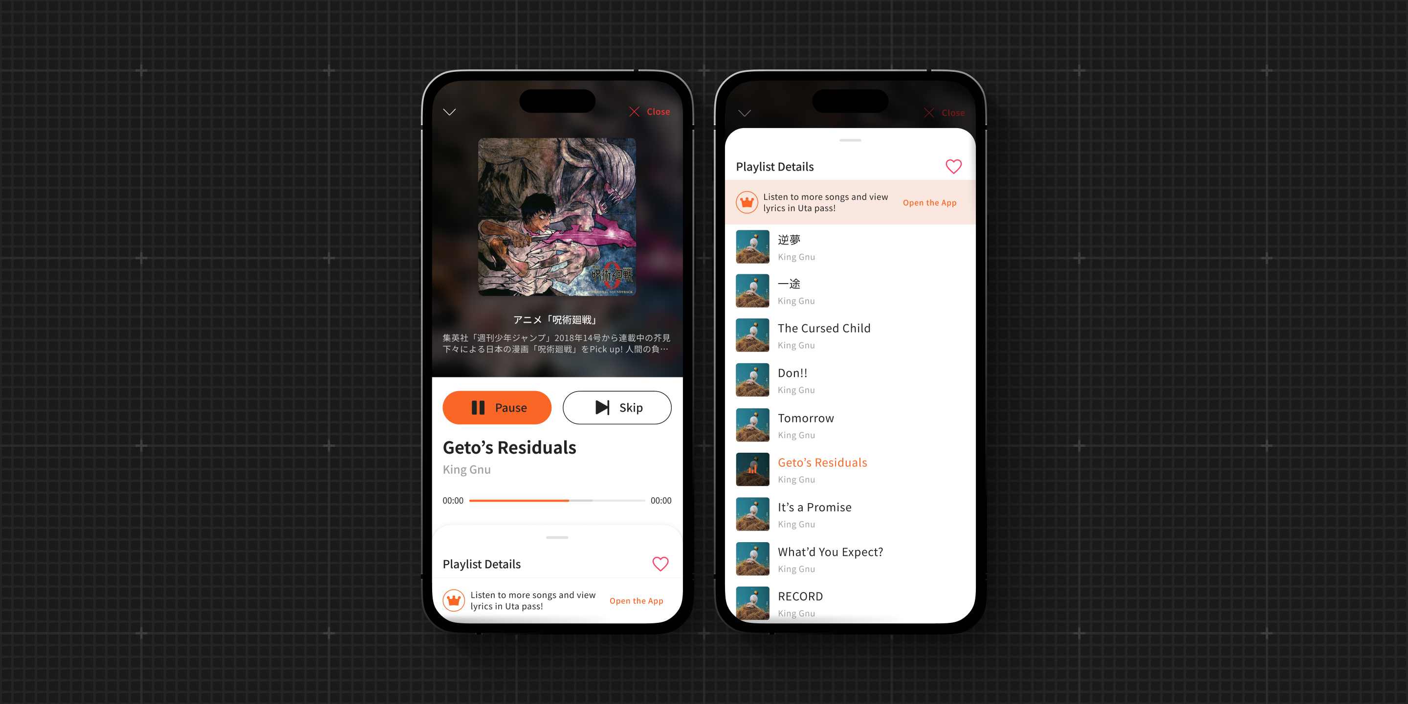
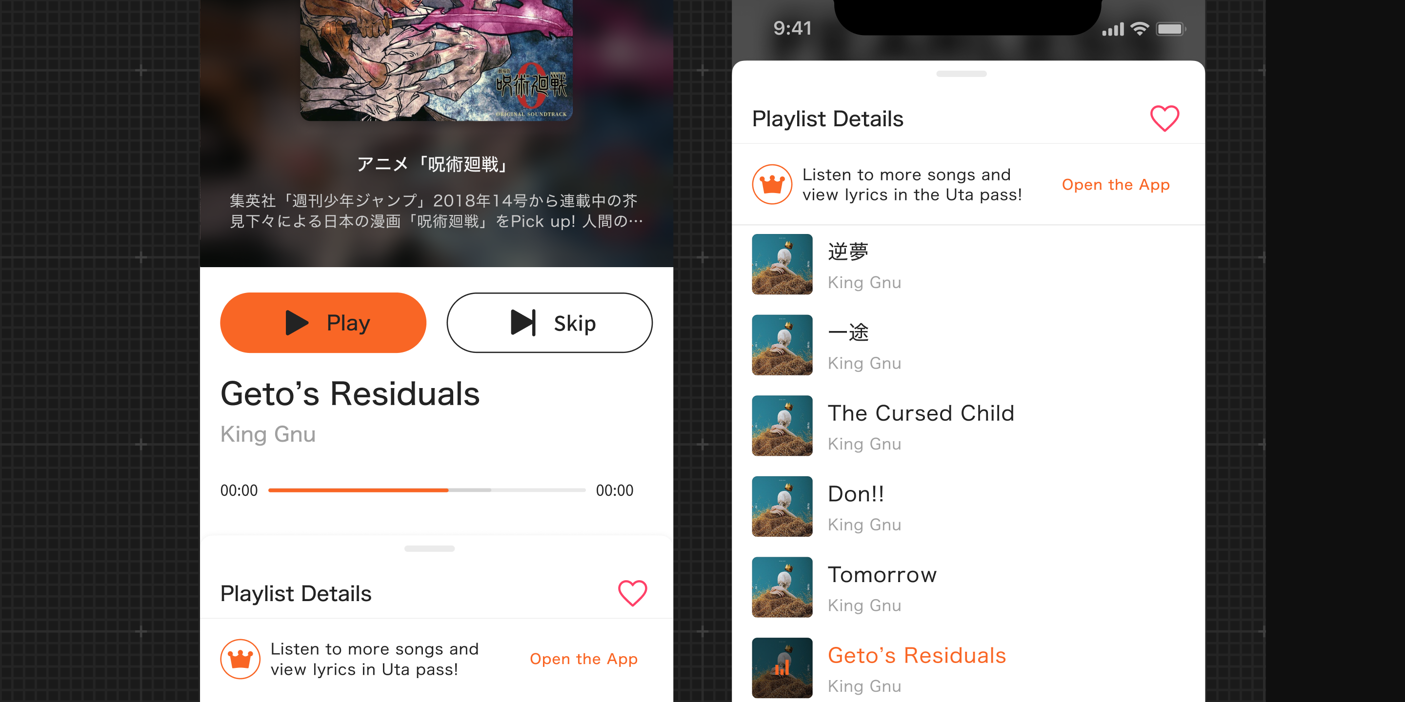
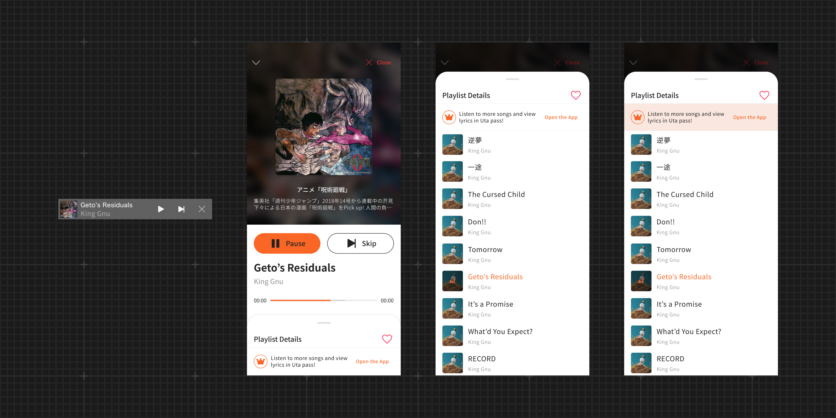
Create a two-layer playback layout
To make playback controls easier to notice and use, the interface separates playback actions from browsing content, moving playlist exploration to a secondary layer.
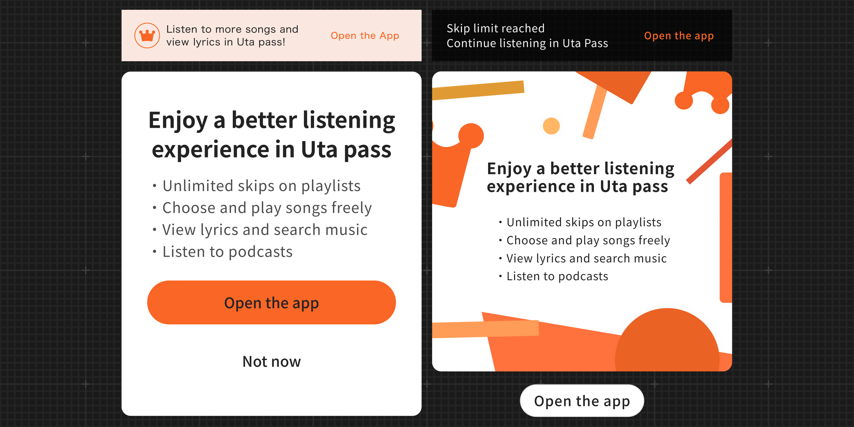
Design a notification system
To help users understand restrictions with appropriate context, I designed a graduated notification system—toasts, popups, banners, and ad-music prompts.
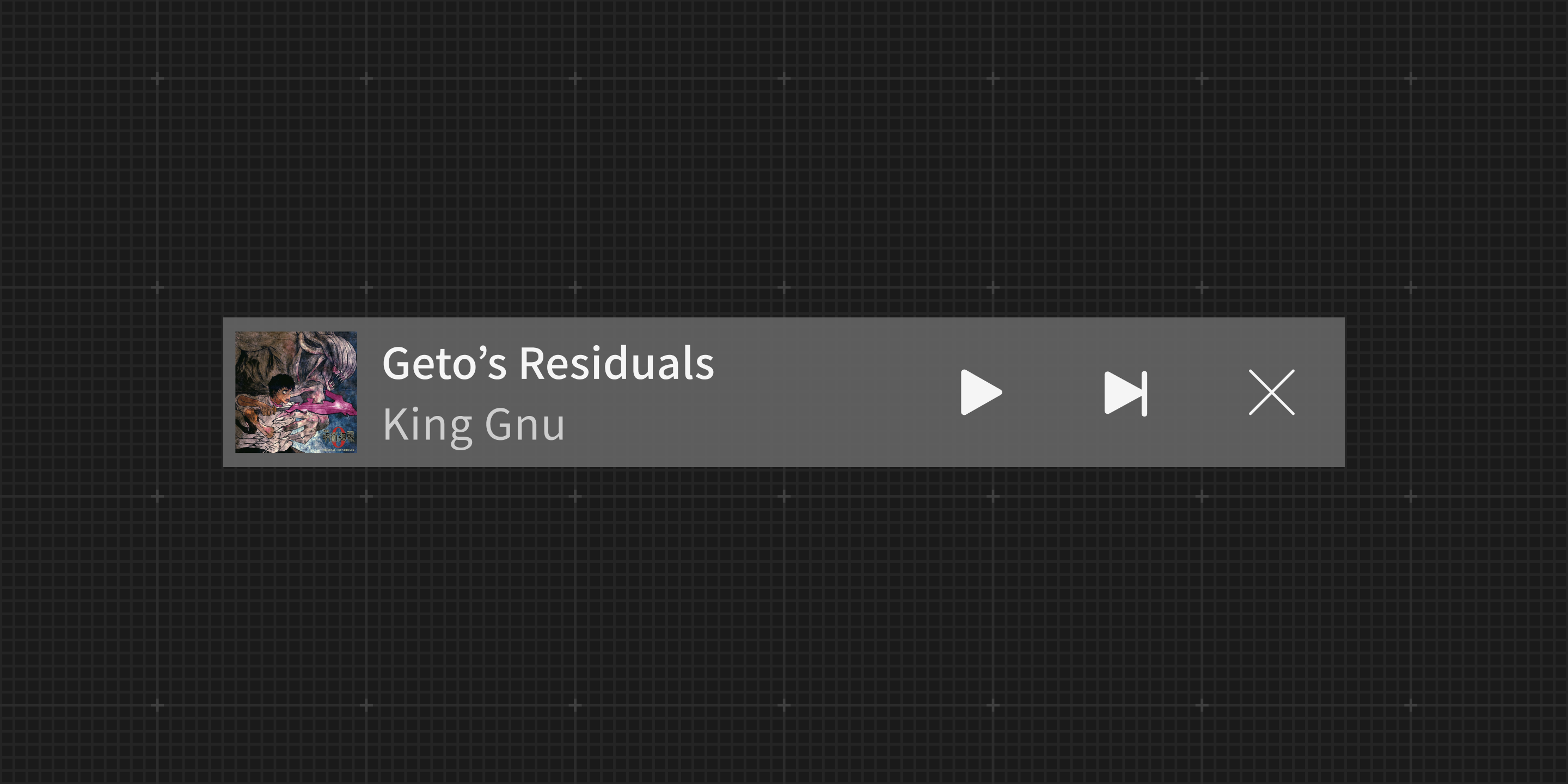
Introduce a mini player
To support continuous listening, the mini player keeps music playing while users navigate other services and provides quick access back to the full player.
[Delivery]
Freemium can still feel good
After launch, users began listening longer and across more areas of the app. The persistent mini player reduced session drops, and the graduated notification system gave users clearer reasons to explore the full music service.

[Reflection]
Usability is the foundation of monetization
This project reinforced a simple lesson: monetization only works when the listening experience feels effortless. Making it easier to start and control playback increased engagement first, which then made upgrade prompts more meaningful instead of intrusive.
Designing beyond ideal conditions
Because the product serves an older user base, many users increase text size. This revealed that the existing dynamic type implementation frequently broke the layout, so I took the opportunity to redefine typography scaling rules to ensure the new design held up under real usage conditions.
Thanks for reading.